


If you have been keeping half an eye on packaging trends lately, you have probably noticed the shelf looks different than it did even two years ago. Boxes, bottles, and bags aren't just containers anymore. They are doing the job that used to belong to ads. A good package has to stop someone mid-scroll, mid-aisle, or mid-unboxing video, and make them care.
So what's actually working right now? We pulled together the ten packaging trends shaping 2026, based on what's showing up across e-commerce, retail shelves, and design circles right now. You don't need a huge budget or an in-house design team to borrow from any of these. You just an eye for what fits your brand.
Once you decide on the right packaging direction, the next challenge is presenting it professionally. Customers often judge your packaging through product photos before they ever see it in person. That's why many brands now use AI tools like Blend to create packaging mockups, ecommerce product photography and marketing visuals before the first production batch is even ready.
Packaging Trends
Part of why packaging trends move so fast now is that everyone's watching the same places like packaging magazine roundups, design galleries, and social feeds. So a good idea spreads across categories within weeks instead of years thanks to social media platforms. All you have to do is spot what's working and apply it with your own twist before it goes stale.
Here's what's defining packaging design trends this year, and how you can use each one without blowing your budget. Before we get into the details, here's a quick snapshot if you are skimming:
Packaging Trend | Best Suited For | Primary Benefit |
Sustainable Premium | Skincare, Food, Wellness | Meets eco-demands without sacrificing a luxury feel |
Quiet Minimalism | Supplements, Home Goods | Builds immediate product trust and clarity |
Chrome & Metallic | Spirits, Fragrances, Cosmetics | High social media shareability and shelf pop |
Vintage Cues | Craft Beverages, Artisan Foods | Creates immediate emotional heritage and story |
Smart/QR Packaging | Tech, Beauty, F&B | Extends brand story past the point of purchase |
Editorial Typography | Coffee, Craft Food, Lifestyle | Turns packaging into something worth reading |
Artist Collaborations | D2C, Limited Editions | Builds cultural relevance and collectibility |
Unconventional Shapes | Beverages, Novelty Products | Impossible-to-ignore shelf disruption |
RELATED READING: Design Trends 2026: 13 Trends You Need to Know Before You Redesign Anything
10 Packaging Trends You Need to Know for 2026
Without further ado, let’s take a look at the best packaging design trends in 2026 that you must try out with your brand too:
1. Sustainable Packaging That Doesn't Look Like a Compromise
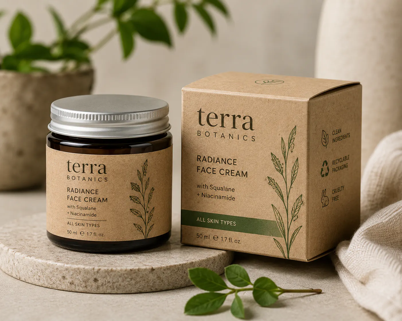
Sustainable packaging trends used to mean one thing: brown kraft paper, a leaf logo, and not much else. That era is over. In 2026, sustainable packaging trends look genuinely premium. Like using recycled paper, compostable films, and lightweight aluminum are showing up with bold colors, textured finishes, and details that feel intentional instead of apologetic.
Key features:
- Recycled or mono-material stock that's actually recyclable, not just labeled that way
- Muted, earthy palettes lifted with unexpected pops of color
- Reduced secondary packaging (less tape, less filler, less waste)
- Matte, uncoated finishes that feel tactile rather than plasticky
Before ordering hundreds of new boxes, it's worth seeing how they'll look in real life. Blend lets you generate realistic packaging mockups and AI product photography, so you can compare recycled materials, labels and colour palettes before committing to production.
2. Quiet, Minimalist "No-Fuss" Design
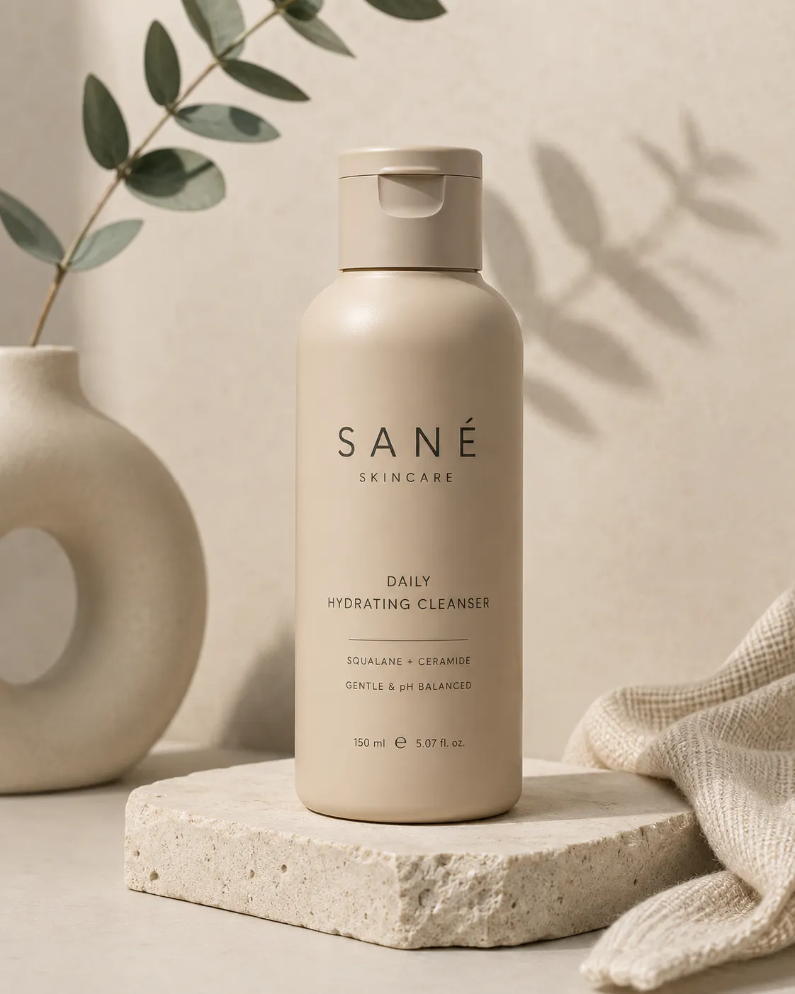
After years of loud, maximalist branding, a lot of the best packaging design happening right now is going the other way. They include blocky shapes, muted beiges and greys, one clean sans-serif font, and labels stripped down to only what actually matters. It borrows from old-school tool and tech design. Nothing decorative, just confidence in the product itself.
You have almost certainly seen this in action already. Rhode's skincare line built its entire visual identity around this kind of restraint. They have used soft beige tones, minimal type, and packaging that looks more like a considered object than a marketing vehicle. Similarly, even The Ordinary started this approach with its clinical, ingredient-first labeling, and it's still one of the most-copied looks in the category.
Clean packaging only works if your product photos are just as clean. Using Blend, you can create white-background product images, catalogue photos and lifestyle shots that match your minimalist branding without organising a studio shoot.
3. Chrome, Steel, and Metallic Finishes
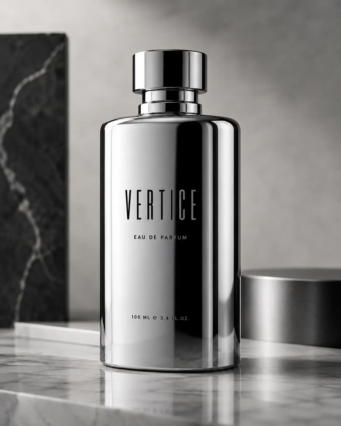
If minimalism is one end of the spectrum, this is the other. Chrome, brushed steel, and metallic foils are showing up everywhere from perfume bottles to premium spirits and wine packaging, giving products a durable, almost futuristic look.
It's one of those cool package design ideas that photographs incredibly well, which is a big part of why it's spreading fast on social feeds. You will also see it on trending vodka bottle packaging heading into 2026. Metallic finishes are an easy way to make a spirits brand look instantly more premium without changing the liquid inside the bottle.
You don't need to cover the whole package. A single foil strip, metallic cap, or reflective label can capture the look without inflating your production costs.
Byredo has leaned into this for years with its numbered, industrial-feeling fragrance packaging, and it's a big part of why the brand photographs so well on shelves and in flat-lays. On the spirits side, 1942 Tequila built its whole shelf presence around a bold, reflective bottle finish that reads as premium from across a bar
RELATED READING: How to Make a Vintage Postcard Template That Actually Looks Like It Traveled Through Time
4. Hand-Crafted, Imperfect Textures
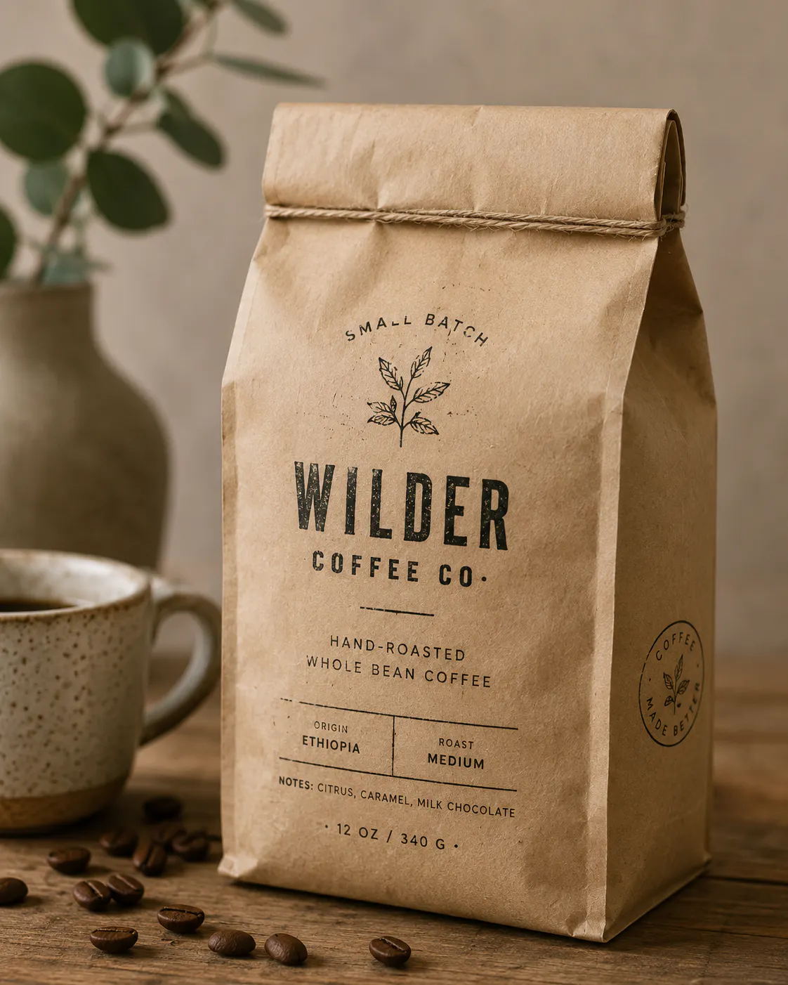
Right alongside all that polished metal, there's a trend pulling in the opposite direction. We are talking about packaging that looks like an actual person made it. Stamped textures, uneven ink, slightly crooked edges. It is a deliberate reaction to everything feeling too smooth and AI-generated. If your brand has a story worth telling, this is a low-cost way to make that story visible.
Tip: A rubber stamp and a kraft paper wrap can get you most of the way here. You don't need custom tooling to pull this off.
5. Nostalgic, Vintage-Inspired Packaging
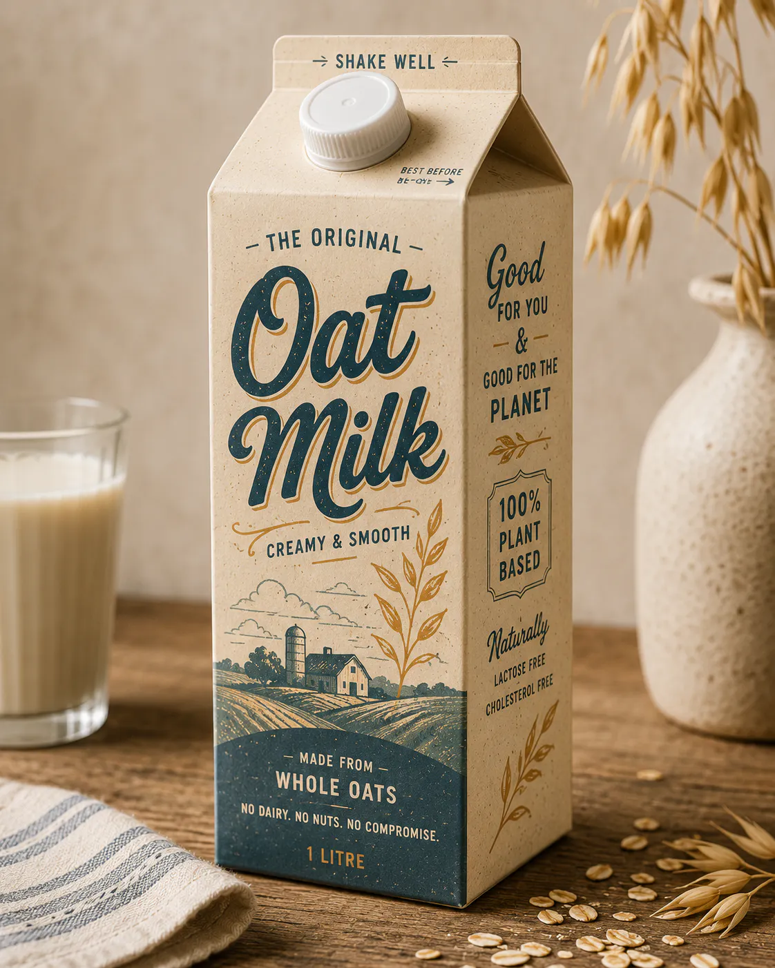
Heritage cues are back, but not in a stiff, museum-piece way. Brands are pulling from old advertising, vintage typefaces, and archival illustrations, then mixing them with modern color and layout choices. The result feels familiar but unmistakably trendy.
Think of archival-style illustrations or line work and bold colors that keep the look from feeling dated. Oatly is one of the clearest examples of this working at scale.
6. Smart Packaging and QR-Driven Experiences
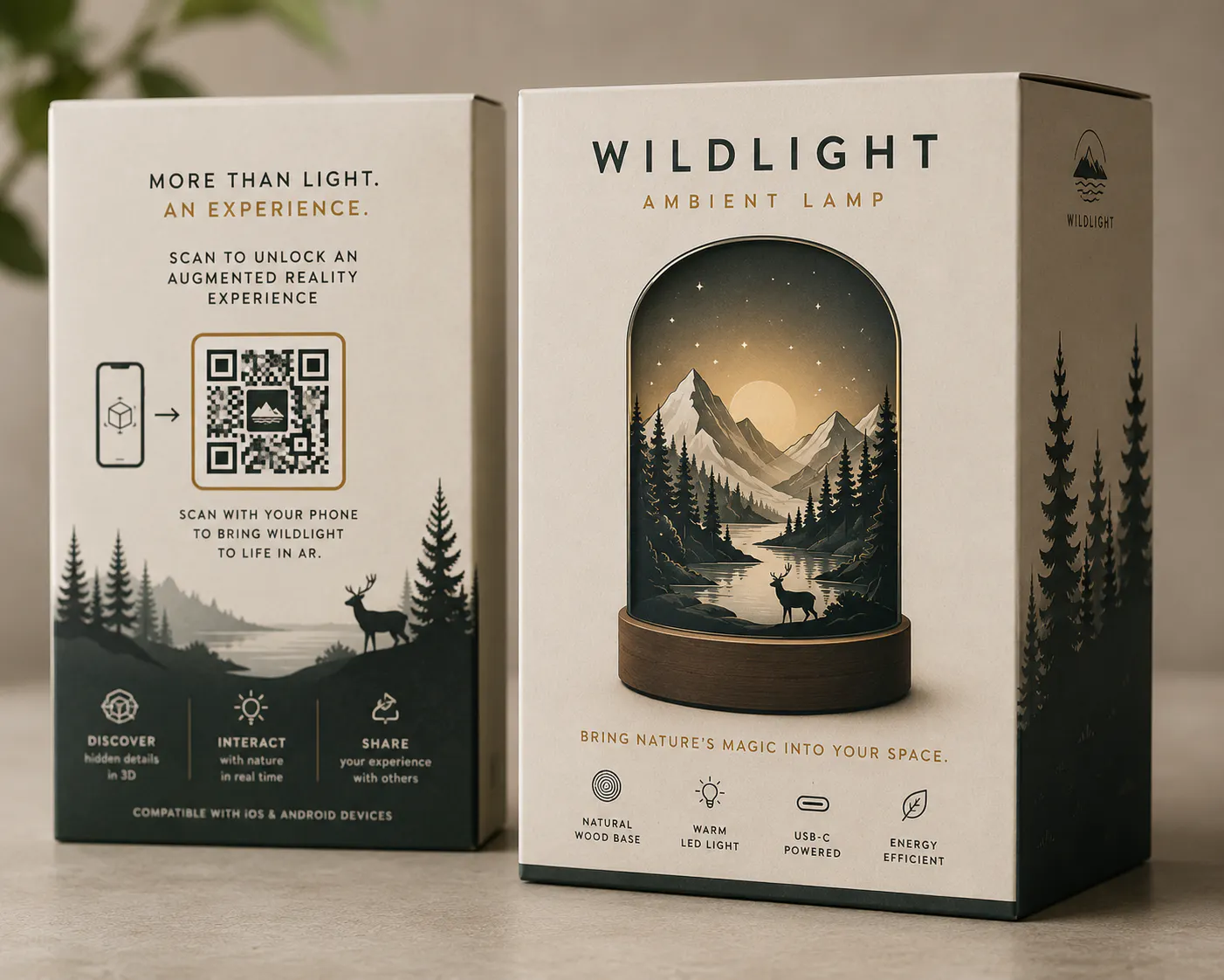
When people search "what are current trends in packaging," a lot of them are really asking about function, not just looks. This is where packaging innovation comes in. QR codes aren't linking to boring FAQ pages anymore.
They are unlocking augmented reality try-ons, sourcing stories, and even mini games. Packaging has limited physical space, but your brand's story doesn't have to stop at the label.
Tip: You don't need a full AR build to benefit. Even a QR code linking to a short "how it's made" video extends the life of your packaging well past the unboxing moment.
RELATED READING: How to Start a Luxury Clothing Brand (Without Burning Through Your Savings)
7. Bold, Editorial-Style Typography
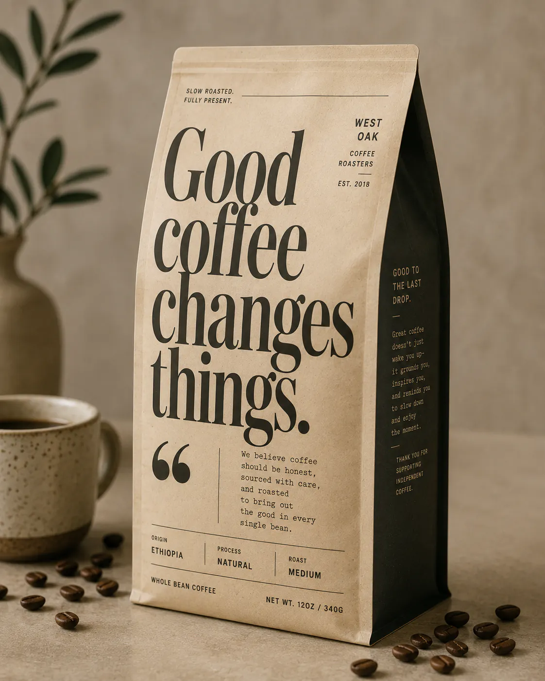
Some of the most eye-catching packaging design trends this year skip imagery altogether and let words do the heavy lifting. Oversized headlines, pull quotes, and dense product storytelling. They look like they are borrowed straight from magazine and poster design.
All you have to do is turn a box or label into something people actually want to read, not just glance at.
Key features:
- Oversized, expressive typography as the main visual element
- Editorial-style grids and layered text hierarchy
- Long-form storytelling printed directly on the packaging
- A confident, authentic tone rather than polished ad copy
8. Artist Collaborations and Limited-Edition Runs
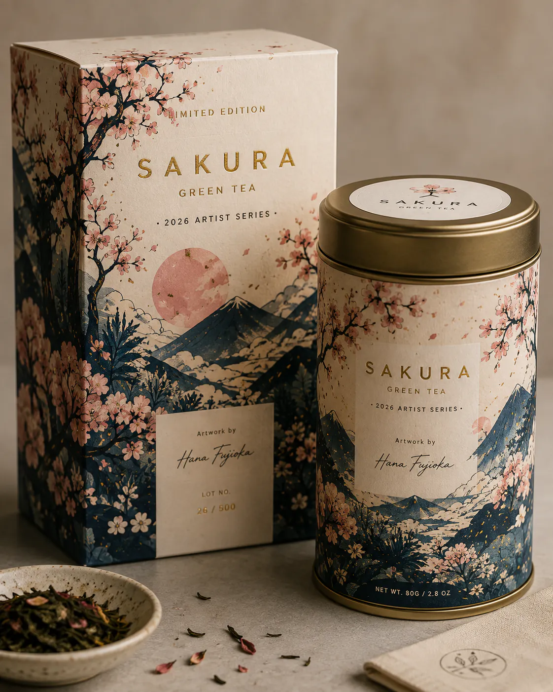
More brands are commissioning independent artists to turn their packaging into something closer to a collectible than a container. It's a smart way to stand out and connect with a local creative community at the same time, and it gives customers a reason to buy the same product again just to get the new design.
Limited-edition packaging also deserves limited-edition marketing. Instead of arranging another photoshoot every time artwork changes, Blend lets you generate fresh promotional visuals within minutes.
9. Unconventional Shapes and Shock-Value Packaging
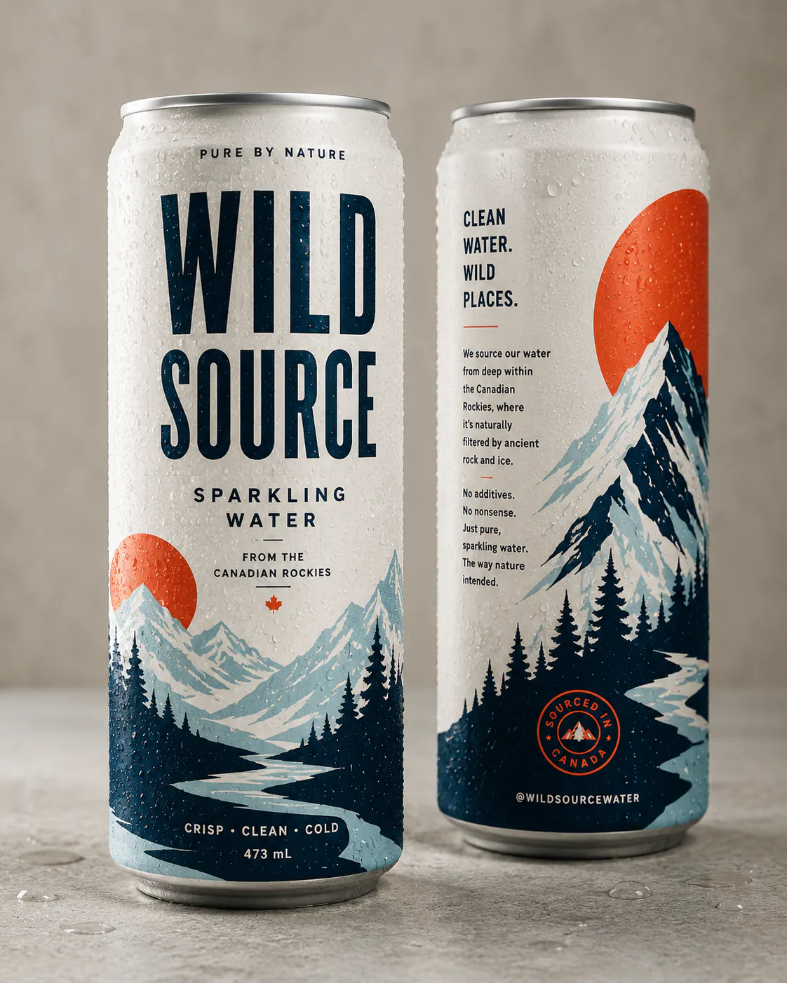
As shelves get more crowded, some brands are leaning all the way into "wrong on purpose." Think industrial-style pump bottles for skincare, tin-can packaging for spirits, or shapes that make you do a double-take before you even read the label. It's playful, a little jarring, and impossible to scroll past.
Liquid Death is the textbook example here. They have canned plain water in tall, heavy-metal-style tallboy cans usually reserved for energy drinks or beer was "wrong" on paper, and that's exactly why it worked. It made a commodity product impossible to ignore on a shelf full of identical plastic bottles, and it's since become one of the most talked-about packaging stories in beverage.
RELATED READING: Magazine Cover Maker: How to Design Professional Covers Online
10. AI-Assisted Design and Personalization
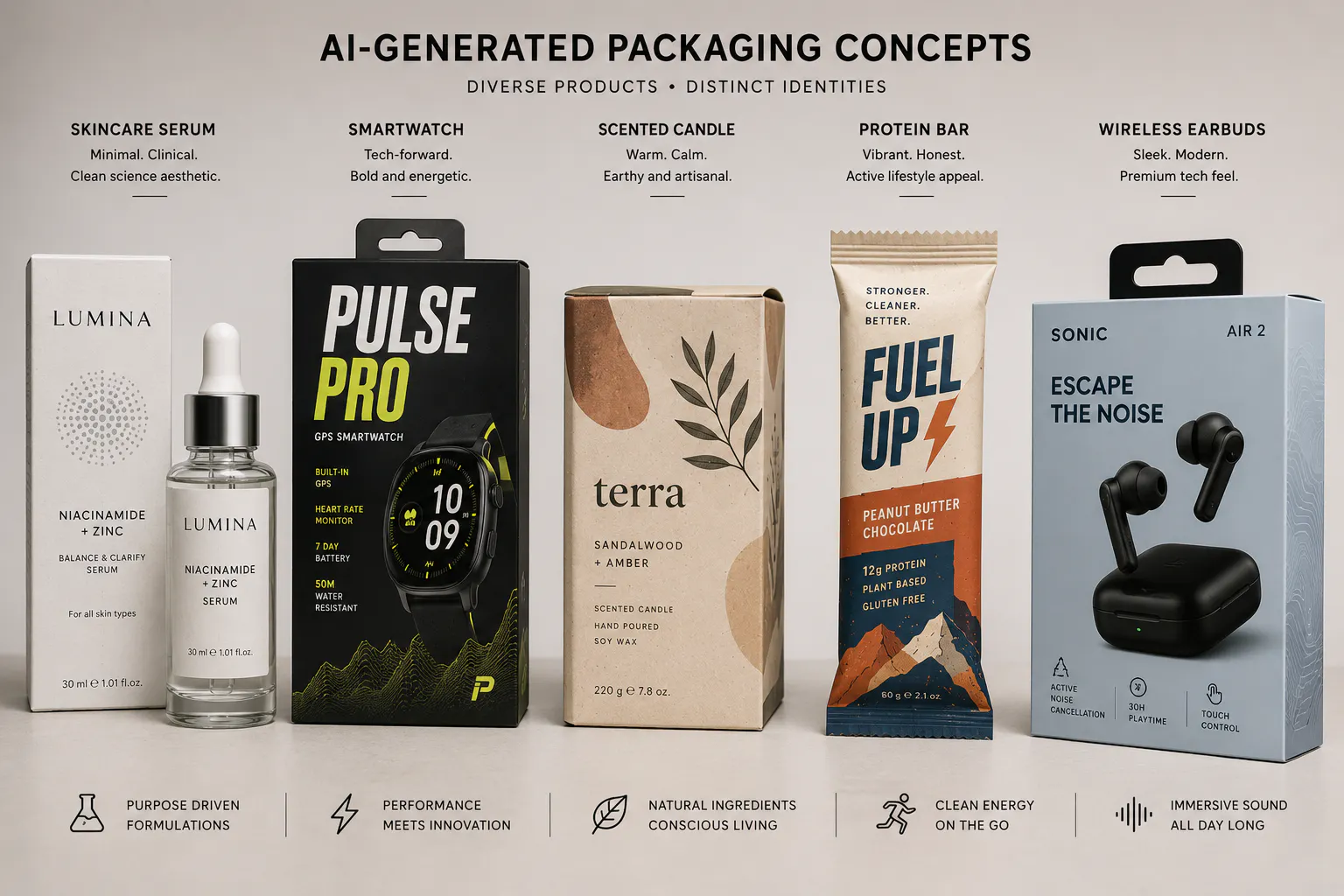
Behind almost every trend on this list, AI is quietly speeding things up. With the help of AI, brands are generating design variations, testing color palettes, and making short-run personalization actually affordable.
What's interesting is that the more AI gets involved in the design process, the more brands are leaning into human touches (hand stamps, artist collaborations, imperfect textures) to balance it out. The two trends are feeding each other, not replacing one another.
Don't Forget the Photo That Sells the Package
Here's the part that gets skipped constantly: none of these packaging trends matter if nobody sees them clearly. Most customers meet your packaging on a screen first. They see it on a product listing, an Instagram post, or your website hero image even before it's in their hands. A flat, poorly lit photo can make even the best packaging design look forgettable, no matter how much thought went into the box itself.
That's exactly the gap Blend fills. Instead of booking a photographer every time you want a clean white-background shot for Amazon or Etsy, or a lifestyle scene showing your new packaging on a shelf, in a kitchen, or in someone's hands, you can generate those images yourself in a few clicks.
Conclusion
You don't need to chase all ten packaging trends at once. Pick the one or two that genuinely fit your product and your customer, and commit to them properly. And when you are done choosing the right packaging for your product, Blend can turn your packaging concepts into studio-quality product photos, packaging mockups, ecommerce listing images and lifestyle photography in minutes, helping your products stand out long before they reach a customer's hands.