


Instagram has changed a lot over the years, but one thing hasn't. People still stop for content that tells a story. A single image can grab attention, but a seamless Instagram carousel keeps people swiping. Instead of showing separate slides, each image flows naturally into the next, creating one continuous design across multiple cards. The result feels more immersive, looks more professional and encourages users to stay on your post for longer.
If you are trying to grow your account, increase engagement or showcase your products in a more creative way, a seamless carousel is worth adding to your content strategy. Check out below how you can design a seamless Instagram carousel and how modern design tools like Blend can help you create polished carousel posts much faster.
What is a Seamless Instagram Carousel?
A seamless Instagram carousel is a multi-slide post where one design stretches across every slide. Instead of each card looking like a separate graphic, all the slides connect to form one continuous image.
As someone swipes, the artwork appears to move naturally from one slide to the next. This creates a smooth viewing experience that keeps your audience curious about what's coming next.
Imagine creating:
- A panoramic travel photograph spread across six slides.
- A product launch where every swipe reveals another feature.
- A step-by-step tutorial that unfolds naturally.
- A storytelling post where each slide builds anticipation.
The seamless effect transforms an ordinary carousel into an interactive experience. Unlike a traditional carousel where every slide stands on its own, a seamless carousel encourages people to keep swiping until the end. That extra interaction can send positive Instagram engagement signals to Instagram's algorithm.
When Should You Use a Seamless Instagram Carousel?
Not every post needs a seamless layout. Sometimes, a single image is enough. Other times, a standard carousel works perfectly well. A seamless Instagram carousel makes the biggest impact when your content tells a story or benefits from a continuous visual flow.
For example, if you are introducing a new product, you can dedicate each slide to one feature while keeping the background connected. The experience feels cohesive rather than fragmented.
If you are teaching something, each swipe can reveal the next step without making readers feel like they're starting over.
This format works especially well for:
- Product launches
- Brand storytelling
- Educational posts
- Design portfolios
- Fashion lookbooks
- Travel photography
- Interior design showcases
- Recipe guides
- Marketing tips
- Case studies
Creators also use seamless carousels to make quote collections, book recommendations and personal stories more engaging.
RELATED READING: How to Edit Photos for Instagram Online – AI Tips & Tricks
What Makes a Seamless Carousel Successful?
A beautiful design is only one part of the equation. The best seamless Instagram carousel posts combine good design with thoughtful storytelling.
1. Start with a strong first slide
Your first slide determines whether someone stops scrolling. Think of it as your headline. It should immediately communicate why your post deserves attention. Instead of beginning with lots of text, keep things simple. A bold headline, an intriguing visual or a surprising statistic can make someone pause long enough to start swiping.
2. Guide people naturally
One mistake many creators make is treating every slide like a separate design. Instead, think of your carousel as one long canvas that's divided into multiple sections. Use connecting backgrounds, flowing shapes or consistent illustrations that encourage movement across every slide.
You don't need dramatic transitions. Sometimes a simple colour gradient, a continuous photograph or subtle design elements are enough to create the seamless effect.
3. Keep your text readable
It's tempting to fill every slide with information. Avoid that. Each slide should communicate one clear idea. People are browsing Instagram quickly, often on small phone screens. Long paragraphs can make your content feel overwhelming.
Instead, break complex ideas into smaller sections across multiple slides. Your audience will absorb more information while continuing to swipe.
Take a look at these carousel examples made using Blend's AI Image feature:
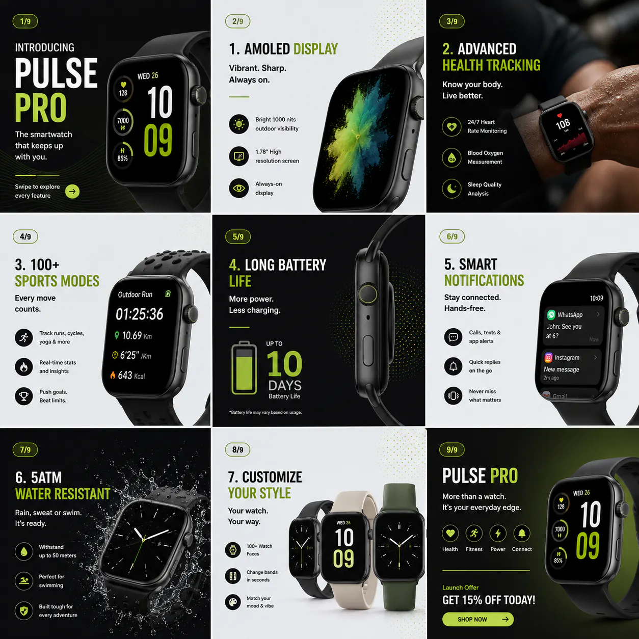
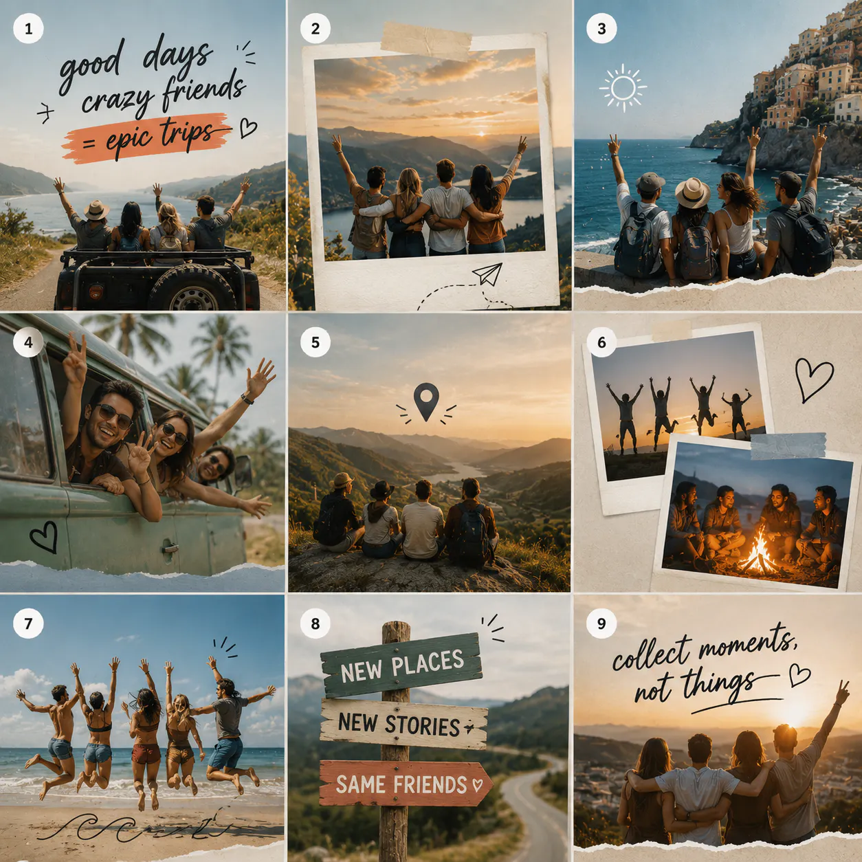
How to Create a Seamless Instagram Carousel with Blend
Creating a seamless Instagram carousel is much easier when you follow a structured workflow. Here's how our design team approaches it.
Step 1: Prepare your images
Upload your product photos, lifestyle shots, or graphics into Blend. Before building the carousel, make sure every image has a consistent look. You can enhance lighting, remove distracting backgrounds and make small edits using Blend so the entire carousel feels cohesive.
Step 2: Plan the full layout
Instead of designing one slide at a time, think of your carousel as one long canvas. Decide where each headline, image and graphic will appear so the design flows naturally from the first slide to the last.
Step 3: Keep branding consistent
Choose one colour palette, one or two fonts and consistent spacing throughout the design. Small details like these make your carousel look polished and instantly recognisable.
Step 4: Split the design into Instagram slides
Once you are happy with the full layout, divide the canvas into individual Instagram-sized slides. Check that important text and product images don't sit directly on the boundaries between slides.
Step 5: Preview before exporting
Swipe through the slides in order before publishing. This helps you catch alignment issues, awkward transitions or text that's difficult to read on a mobile screen.
Step 6: Publish in the correct order
Upload every slide in sequence and write a caption that encourages people to keep swiping. A strong first slide paired with a clear call to action on the final slide gives your carousel the best chance of driving saves, shares and profile visits.
RELATED READING: Scroll-Stopping Visuals: How to Win Instagram with AI Model Photoshoots
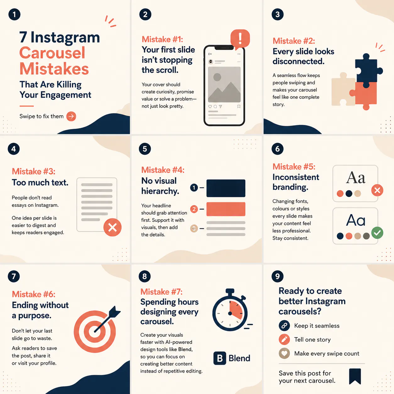
7 Instagram Carousel Mistakes That Are Killing Your Engagement
A well-designed Instagram carousel can increase engagement, encourage saves and keep people swiping. But even the best ideas can fall flat if your carousel isn't planned properly. Here are seven common mistakes to avoid.
1. Your first slide isn't stopping the scroll
Your cover slide is your first impression. Use a bold headline, eye-catching visual or intriguing question that makes people want to swipe.
2. Every slide looks disconnected
A good carousel should feel like one complete story. Use consistent colours, fonts and layouts to create a seamless flow from one slide to the next.
3. Too much text
Long paragraphs overwhelm readers. Focus on one key idea per slide and keep your copy short, clear and easy to scan.
4. No visual hierarchy
Don't make every element compete for attention. Use larger headings, supporting text and visuals to guide readers through the content naturally.
5. Inconsistent branding
Changing fonts, colours or design styles across slides makes your carousel look unprofessional. Stick to a consistent visual identity that reflects your brand.
6. Ending without a purpose
Your last slide shouldn't simply end the story. Include a clear call to action, such as asking people to save the post, share it or visit your profile.
7. Spending hours designing every carousel
Creating high-quality carousels doesn't have to be time-consuming. Instead of switching between multiple editing tools, use an AI-powered design platform like Blend to create professional visuals faster. You can edit images, maintain consistent branding and prepare polished social media graphics from one place.
Design Tips For a Seamless Instagram Carousel
A seamless layout grabs attention, but thoughtful design is what keeps people swiping. Every decision should make the experience feel effortless.
1. Keep your branding consistent
Use the same colour palette, fonts and visual style throughout the carousel. Your audience should immediately recognise your content without seeing your username. That doesn't mean every carousel has to look identical. Instead, develop a design system that gives your posts a familiar look while allowing room for creativity.
2. Create a clear visual path
Your audience shouldn't have to guess where to look next. Use lines, shapes, illustrations or image placement to naturally guide the eye from one slide to another. This subtle movement makes the carousel feel connected without distracting from your message.
3. Balance visuals with text
The biggest mistake many creators make is treating Instagram like a blog. Remember, people are scrolling quickly. Use visuals to support your message rather than relying entirely on text. A strong image, illustration or product photo often communicates more than a lengthy paragraph. When you do include text, keep it concise and easy to scan.
4. Use high-quality images
A seamless carousel only looks professional if your images are sharp. Avoid low-resolution photos or heavily compressed graphics that become blurry after uploading. If you are showcasing products, use clean, well-lit images with consistent editing. This helps every slide blend naturally into the next.
RELATED READING: How to Make a Collage on iPhone: 3 Easy Ways
Instagram Carousel Dimensions
Getting the dimensions right is essential. Even the best design can lose its seamless effect if your slides aren't exported correctly. For most creators, these are the recommended settings:
Element | Recommended size |
Slide size | 1080 × 1350 pixels |
Aspect ratio | 4:5 |
Resolution | 72 PPI or higher |
File type | JPG or PNG |
Maximum slides | Up to 20 |
Portrait posts generally occupy more screen space than square images, making them a popular choice for increasing visibility in the feed. Before publishing, preview every slide to make sure objects, backgrounds and text align perfectly across the boundaries.
Conclusion
A seamless Instagram carousel does more than make your profile look attractive. It encourages people to slow down, engage with your content and follow your story from beginning to end. Remember that great carousels aren't built around fancy effects. They are built around clear ideas, strong visuals and a smooth reading experience.