



Your brand uses a warm terracotta and cream palette across your website, packaging, and social feeds. Then you generate a lifestyle scene for your latest product, and the AI gives you a cool blue-gray background with chrome accents. The image feels like it belongs to a completely different brand.
Color consistency across product imagery separates brands shoppers remember from brands they scroll past. When your lifestyle scenes reinforce the same color language as your packaging and website, everything feels intentional. When they do not, the disconnect erodes trust.
AI scene generators default to whatever looks generically good unless you direct them otherwise. Here is how to take control.
Why Brand Color Alignment Matters in Product Imagery
Most sellers treat AI-generated backgrounds as interchangeable. But color carries meaning, and mismatched colors send mixed signals.
Colors Set Expectations Before Shoppers Read a Word
A product surrounded by earthy greens and warm wood communicates "natural" and "organic." The same product against neon gradients communicates "bold" and "tech-forward." When your product images consistently reflect your brand palette, shoppers build a visual association over time. When colors drift, that recognition weakens.
What Color Clashes Do to Your Store
A collection page where one product sits on warm beige, and the next on cool slate, breaks the visual rhythm. The shopper's eye recalibrates for each image, which slows browsing and makes the catalog feel uncoordinated. On Instagram, the effect is even stronger, since your grid is a color mosaic and random AI backgrounds fracture it.
Build Your Brand Color Brief for AI
The fix starts before you open any AI tool. You need to translate your brand's visual identity into a language that an AI generator can work with.
Step 1. Map Your Brand Palette to Scene Descriptions
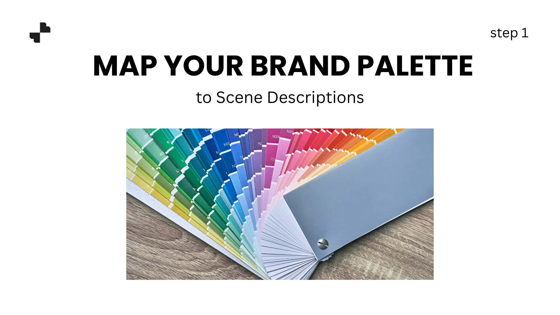
Pull up your brand's color palette. Most brands have 3 to 5 core colors, a primary, a secondary, one or two accents, and a neutral. Write down each color in two formats:
- The hex code or formal name (for your own reference)
- A natural-language description (for AI prompts)
For example:
- Brand primary: #C67B4E → "warm terracotta" or "earthy clay tone."
- Brand secondary: #F5EDE0 → "soft cream" or "warm off-white."
- Accent: #3B5544 → "deep forest green" or "muted olive."
- Neutral: #D4CBC2 → "warm taupe" or "light sandstone."
AI tools do not read hex codes in prompts. Describing colors in natural terms gives the generator something it can actually interpret and apply to surface materials, lighting, and props.
Step 2. Choose Background Tones That Complement Your Palette
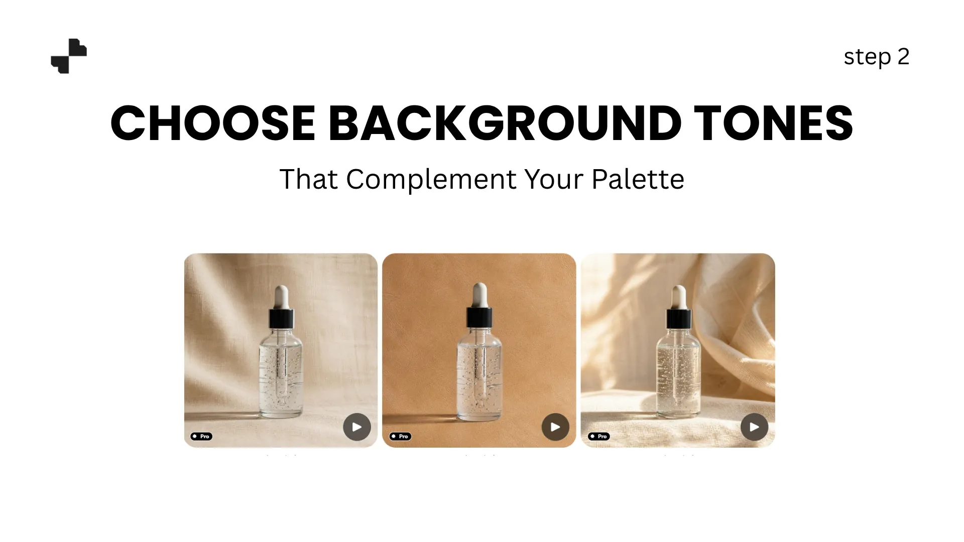
Not every scene element needs to match your brand colors exactly. In fact, a background that is identical to your product color makes the product disappear. The goal is complementary harmony, not exact matching.
A few guidelines for visual branding through background color:
- Warm-toned brands (terracotta, gold, burnt orange) pair well with natural wood surfaces, warm-toned stone, linen textures, and soft ambient lighting
- Cool-toned brands (navy, slate, silver) work with marble, concrete, brushed metal, and crisp directional lighting
- Earth-toned brands (olive, clay, sage) complement raw wood, dried botanicals, woven textures, and soft diffused daylight
- Neutral/minimal brands (black, white, gray) suit clean surfaces, geometric shadows, and high-contrast studio setups
The background should feel like it belongs in the same visual world as your brand without competing with the product for attention.
Generate Scenes That Stay On-Brand
With your color brief in hand, you can now write prompts that consistently produce on-brand results instead of generic ones.
Step 3. Write Color-Controlled Prompts
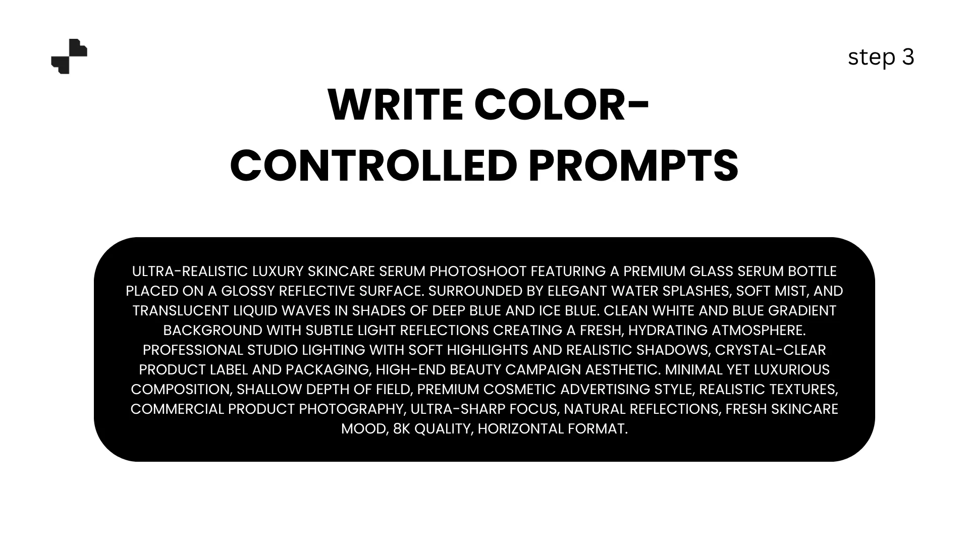
A prompt without a color direction gives the AI freedom to pick whatever looks generically appealing. A color-controlled prompt locks in your palette.
Generic prompt: "Lifestyle scene with a candle on a surface, warm lighting."
Color-controlled prompt: "Candle on a warm terracotta ceramic tray, soft cream linen surface, muted olive plant in background, warm golden-hour side lighting, earth-toned palette throughout."
The second prompt specifies surface color, prop color, and overall palette. The AI image generator now has a clear direction, and every element will pull from the same color family. Reference the natural-language descriptions from Step 1, mention surface material and color together ("warm oak surface" not just "wood"), and include an overall palette instruction ("earth-toned palette throughout").
Step 4. Verify Product Color Accuracy Against the Scene
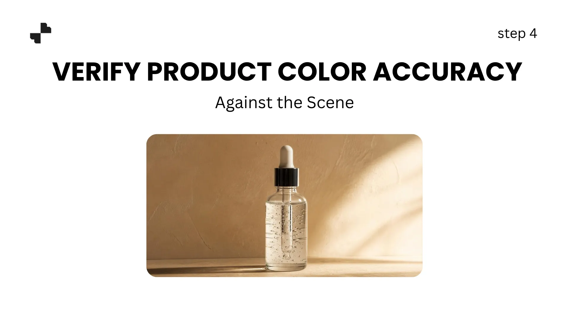
Scene colors affect how your product's colors are perceived. A white product on a warm amber surface may appear slightly yellow. A pastel pink product against cool blue may look more lavender.
After generating each scene, compare the product's colors against the original photo:
- Does the product color look the same as on a neutral background?
- Are label colors and logo hues accurate?
- Do metallic or reflective elements still read correctly?
If the scene pushes a visible color cast onto the product, adjust the lighting description. Specifying "neutral white light on the product, warm ambient light in the background" helps separate product fidelity from scene mood.
Scale On-Brand Scenes Across Your Catalog
A single on-brand scene is a start. Applying that same color language across every product in your catalog is what builds ecommerce photography that feels like a cohesive brand, not a collection of individual images.
Step 5. Save Color Templates for Reuse
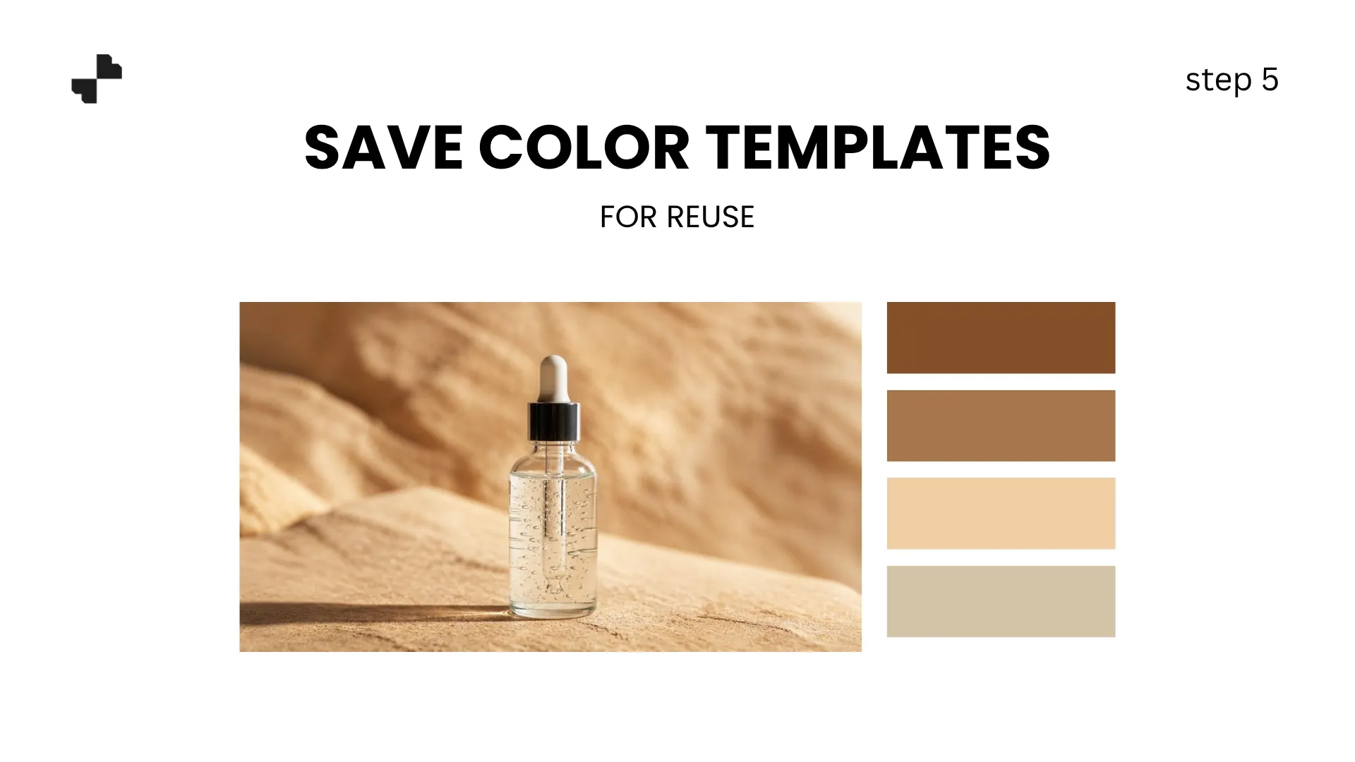
Once you have a prompt that consistently produces on-brand results, save it as a reusable template. Document the full prompt text, a reference image showing the ideal output, and notes on which product types it works with.
When new products arrive, run them through the same template. Generating every product visual with the same color-controlled prompt is what creates catalog-wide cohesion.
For brands with multiple categories, build 2 to 3 templates sharing the same color family but adjusting scene type. A skincare line might use marble for serums and a vanity setup for makeup, but both templates use the same warm-cream and soft-gold direction.
Step 6. Adapt for Seasonal Campaigns Without Losing Your Palette
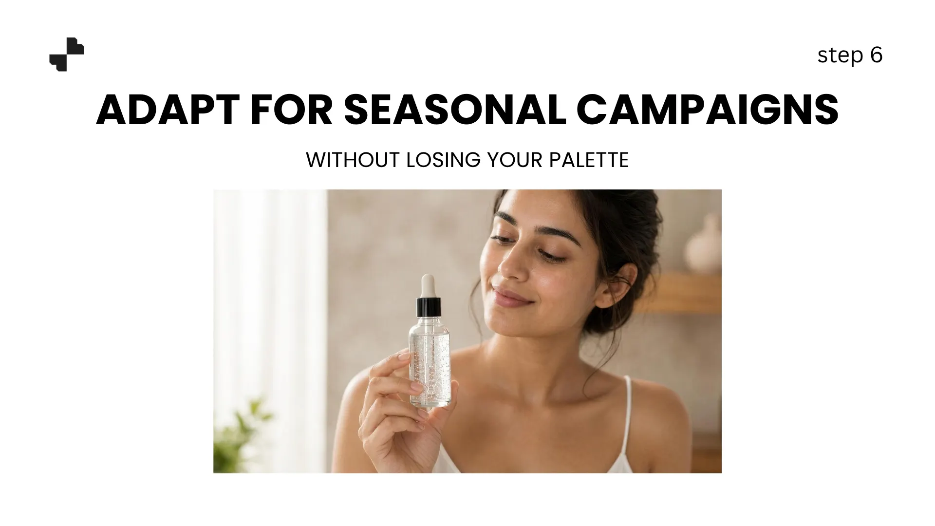
Holiday campaigns, seasonal launches, and limited editions often need different visual energy. The trap is abandoning your brand colors entirely for seasonal themes, which breaks the recognition you have built.
A better approach is to shift the accent colors while keeping the core palette intact. A warm-toned brand running a winter campaign might add deep burgundy and pine green accents to scenes while keeping the terracotta and cream foundation. A cool-toned brand's summer campaign could introduce sandy beige and soft coral without abandoning its slate and navy base.
Adjusting 20 to 30 percent of the palette for seasonal relevance while preserving 70 to 80 percent of the core colors lets campaigns feel fresh without making your AI-generated images look like they belong to a different brand.
Make Every Scene Feel Like Your Brand
AI scene generators produce great-looking backgrounds. But "great-looking" is not the same as "on-brand." Taking control of color in your prompts, building reusable templates, and verifying every output against your palette turns generic product images into recognizable brand assets. Blend handles background removal, AI background generation, and lifestyle scene creation in one platform, so you can apply your brand color direction across every product without switching tools.
Frequently Asked Questions
Should my AI background match my brand colors exactly?
Not exactly. The background should complement your brand palette, not replicate it. Identical colors make the product blend in. Complementary tones from the same color family create harmony while keeping the product visually distinct.
How do I describe my brand colors to an AI tool?
Use natural language, not hex codes. Translate formal color names into descriptive terms that the AI can interpret. "#C67B4E" means nothing to a generator, but "warm terracotta" or "earthy clay tone" produces usable results.
Can AI-generated scenes shift my product's actual color?
Yes. Warm or cool backgrounds can cast a visible tint on the product. Always compare the product's colors in the generated scene against the original photo, especially for labels, logos, and metallic finishes.
How many color templates do I need for my catalog?
Most brands need 1 to 3. One primary template for catalog and listing images, and optionally 1 to 2 variants for different product categories or social media. All templates should share the same core color direction.
Can I use different colors for seasonal campaigns?
Yes, but anchor the campaign in your core palette. Shift 20 to 30 percent of accent colors for seasonal relevance while keeping 70 to 80 percent of the base palette intact. Full palette swaps make your brand unrecognizable.
What if my brand is mostly black and white?
Neutral brands have the most flexibility. Use texture and contrast to create visual interest instead of color. Specify materials like "brushed concrete," "matte black surface," or "crisp white linen" to control the scene while staying on-brand.