
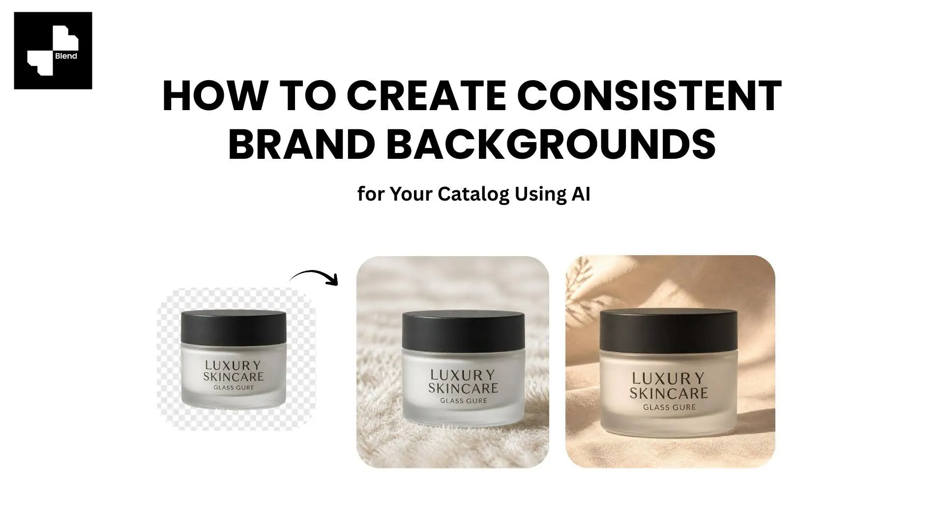



Open any well-run online store and scroll through its collection page. Every product image has the same lighting, the same shadow style, and the same background. Now open a store where images are a mix of phone photos, studio shots, and lifestyle images with different tones. The second store might sell identical products, but it looks less trustworthy.
Background consistency is one of the simplest ways to make a catalog look professional. When every image shares the same visual language, customers browse faster, compare products more easily, and trust your brand more.
The challenge is that maintaining consistency used to require booking the same studio, using the same lighting setup, and reshooting every time you added new products. AI background tools now make it possible to standardize your entire catalog from a single workflow. Here is how to do it step by step.
Define Your Brand's Background Style
Before generating anything, you need to decide what "consistent" looks like for your brand. A minimalist skincare line and a rugged outdoor gear brand need completely different background treatments. The goal is to pick one visual system and commit to it across every product.
Step 1. Choose a Background Type That Fits Your Brand
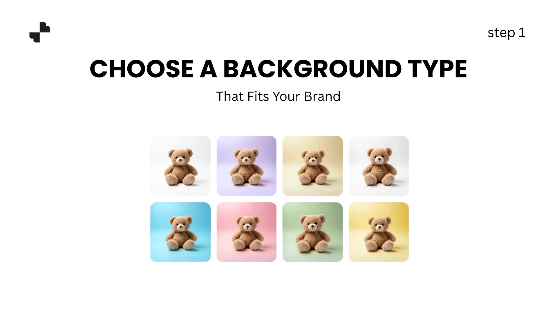
There are three main directions. Pick one as your primary catalog style:
- Clean studio backgrounds. Pure white, soft gray, or a single neutral color. Works well for marketplaces like Amazon and Shopify stores where clarity and product focus are the priority. The simplest to maintain consistently because there are fewer variables.
- Textured surface backgrounds. Marble, wood, linen, concrete, or slate. Adds a premium feel without distracting from the product. Works well for beauty, food, jewelry, and home décor brands that want more visual personality than a plain white backdrop.
- Lifestyle scene backgrounds. Products placed in real-world environments like a kitchen, a bathroom vanity, or a styled desk. Most engaging for social media and ads, but hardest to keep consistent across a full catalog because the scenes vary.
Most brands benefit from a primary style (usually studio or textured surface for catalog pages) plus a secondary style (lifestyle scenes for social and ads). Define both upfront so your visual identity stays coherent across channels.
Step 2. Lock In Your Lighting, Shadow, and Color Profile

Once you have chosen a background type, define the specific settings that make every image feel like it belongs to the same set. Four elements to lock in:
- Lighting direction. Pick one direction (upper left is the most common) and use it for every product. Mixed lighting directions across your catalog are the number one reason collection pages look inconsistent.
- Shadow style. Choose between a soft drop shadow, a contact shadow, or no shadow. Apply the same treatment everywhere.
- Color temperature. Warm, neutral, or cool. Match this to your brand palette. A warm-toned candle brand using cool-toned product backgrounds creates a disconnect.
- Framing and spacing. Keep the product centered with consistent padding around the edges. Every image should place the product at roughly the same scale within the frame.
Write these four decisions down. Your choices become the brief you apply to every image from this point forward.
Build and Apply Your Background Across the Catalog
With your style defined, the production workflow is straightforward. Remove old backgrounds, generate new ones with your locked-in settings, and apply the same treatment to every product.
Step 3. Remove All Existing Backgrounds
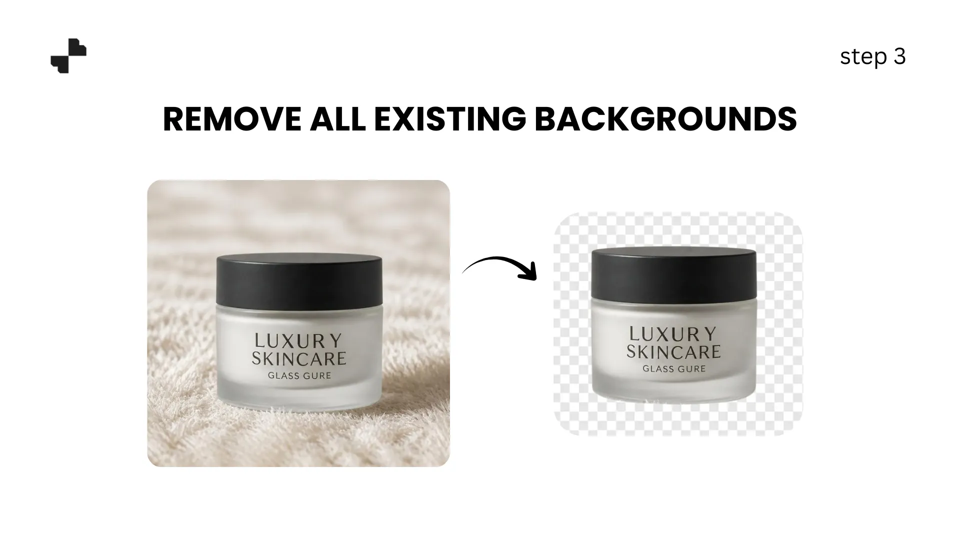
Start with a clean slate. Run every product image through an AI background generator to strip existing backgrounds completely. A transparent cutout gives you maximum flexibility to apply any background style consistently.
For products with tricky edges, like items with fine hardware, transparent packaging, or thin handles, a quick pass with an AI image editing tool cleans up any leftover artifacts. Getting clean cutouts for every product is what makes the next step work.
Step 4. Generate Your First Background and Save the Settings
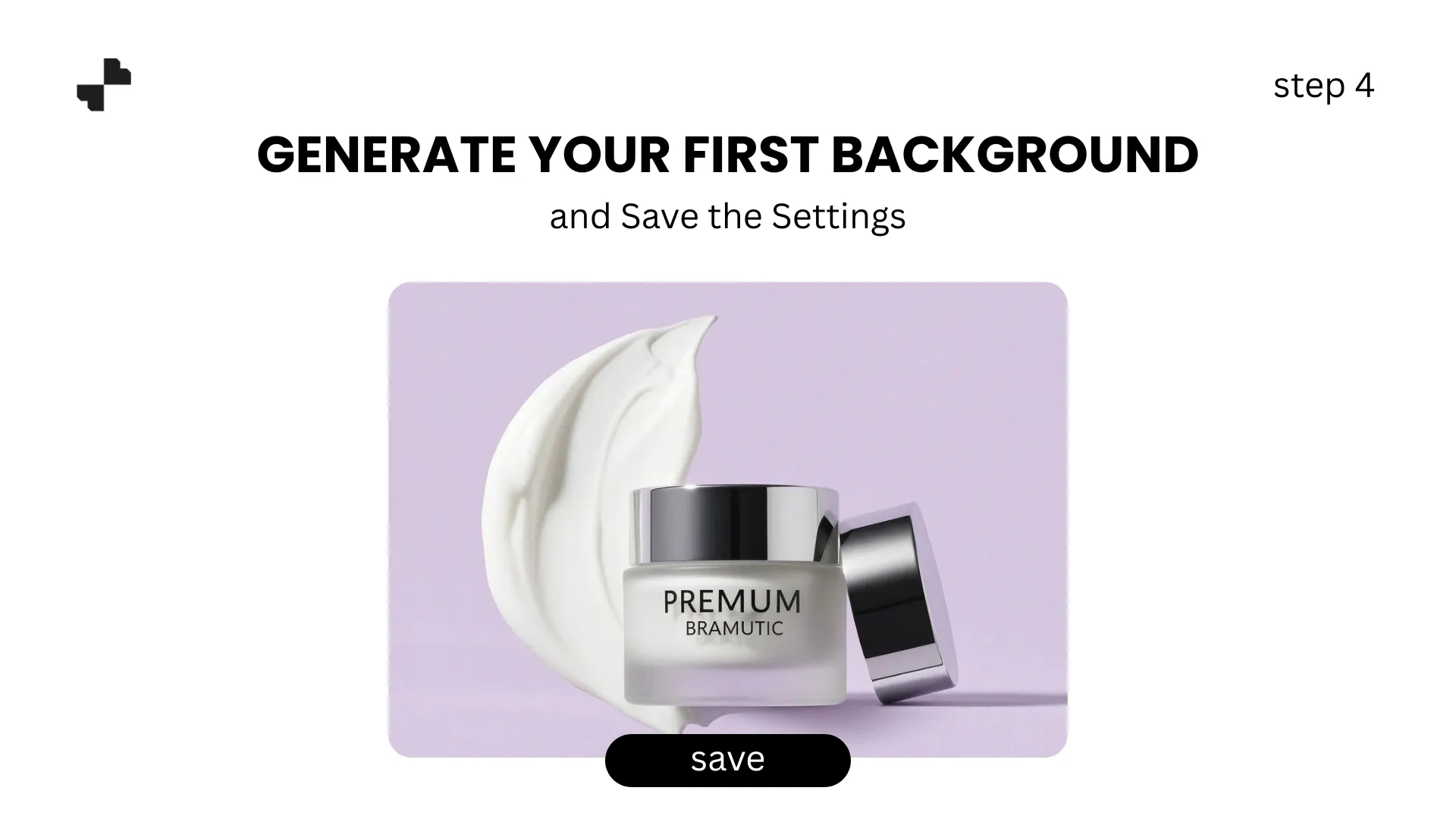
Take one product from your catalog and generate a background using your defined style. Write a specific prompt that captures your lighting, surface, shadow, and mood decisions.
For example, a premium candle brand might use: "Light gray studio background, soft diffused lighting from the upper left, gentle contact shadow, neutral color temperature, product centered with even spacing."
Generate 3 to 4 variations and pick the one that best matches your brand. That version becomes your reference image, the standard every other product in your catalog will match.
Step 5. Apply the Same Settings to Every Product
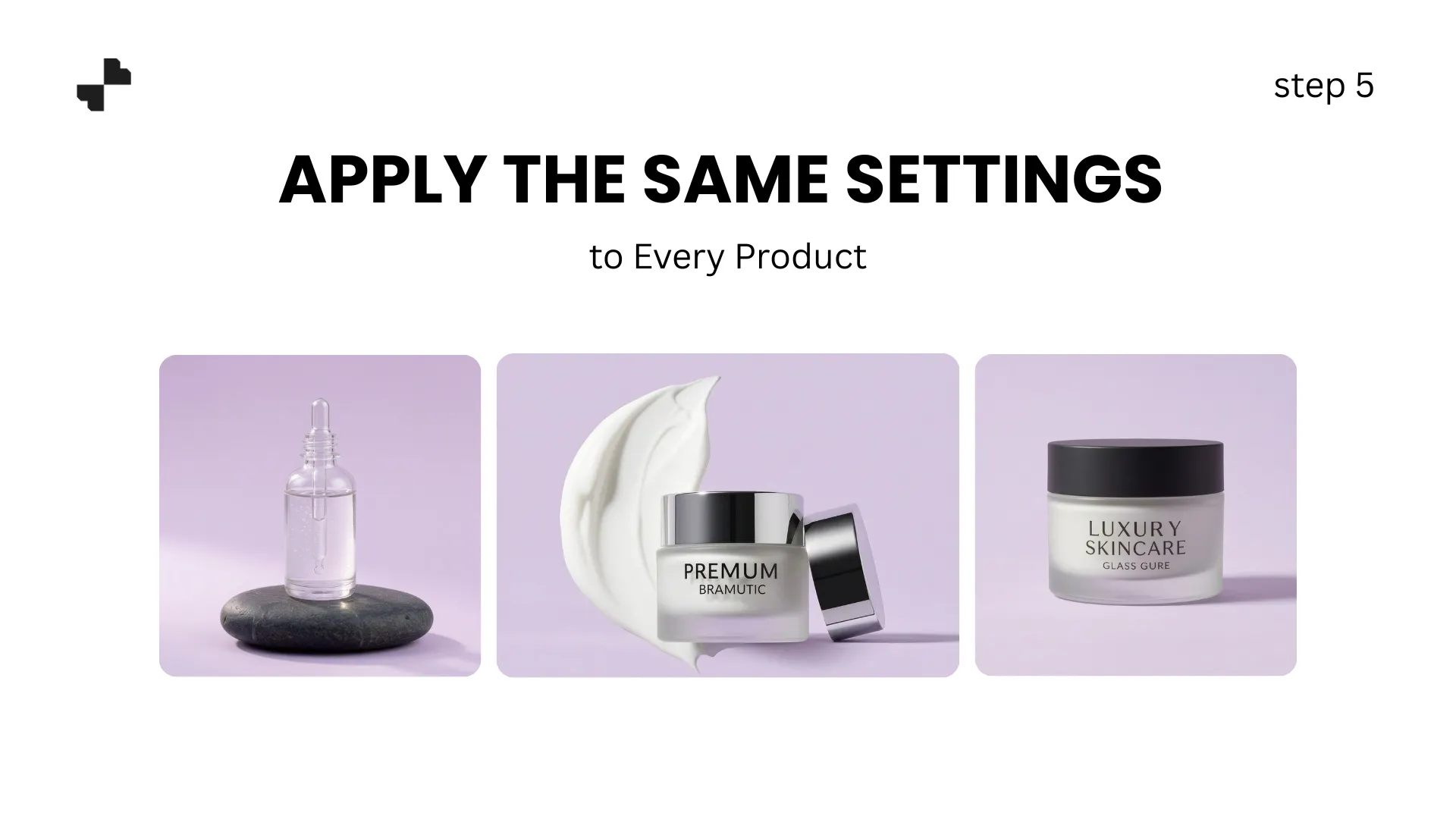
Run each remaining product through the same prompt and settings. The goal is uniformity. When a customer scrolls your collection page, every product should look like it was photographed in the same session with the same product photography AI setup.
Check each output against your reference image. If the lighting shifts slightly on a particular product (which can happen with very dark or very reflective items), adjust the prompt minimally and regenerate. Small corrections now prevent a patchwork catalog later.
Handle Edge Cases Without Breaking Consistency
Real catalogs are messy. You sell products of different sizes, shapes, and materials. New products arrive every month. Seasonal campaigns need different visuals. The trick is handling all of that without losing the consistency you built.
Step 6. Adapt for Different Product Categories
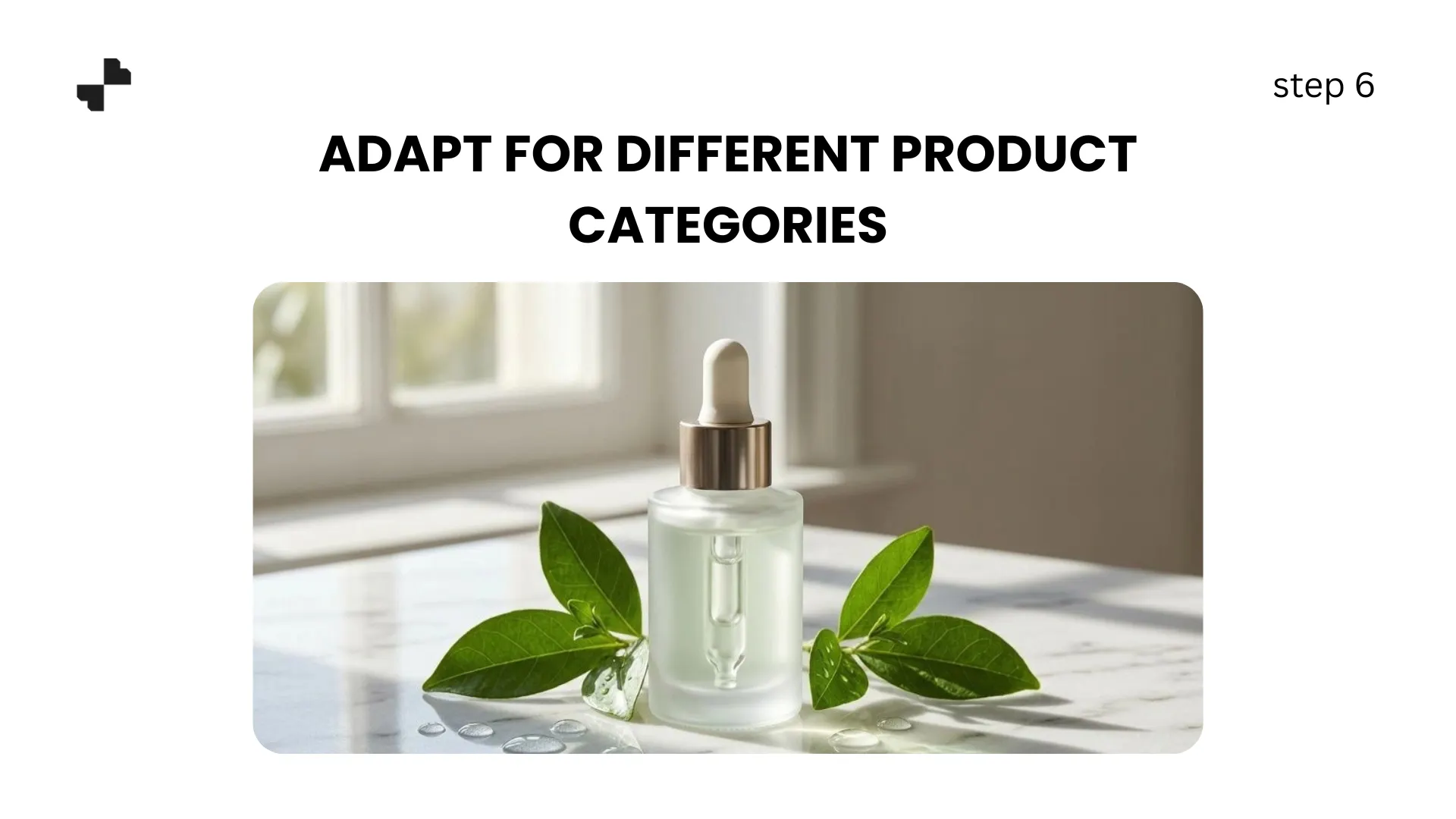
If your brand sells across categories, like a home goods brand with candles, textiles, and ceramics, you may need slight variations within your system. A throw blanket and a small votive candle need different framing to look right.
The fix is adjusting framing and scale while keeping the background, lighting, and shadow treatment identical. The surface, the light direction, and the color temperature stay the same. Only the zoom level and product placement shift. On a collection page, the eye reads this as consistent even though the individual compositions vary.
For brands with very different product types, consider building one sub-template per category. A skincare line might use the same marble surface for jars, bottles, and tubes, but adjust the framing for each size. The product images still feel cohesive because the visual anchors (surface, light, shadow) never change.
Step 7. Maintain the Standard When Adding New Products
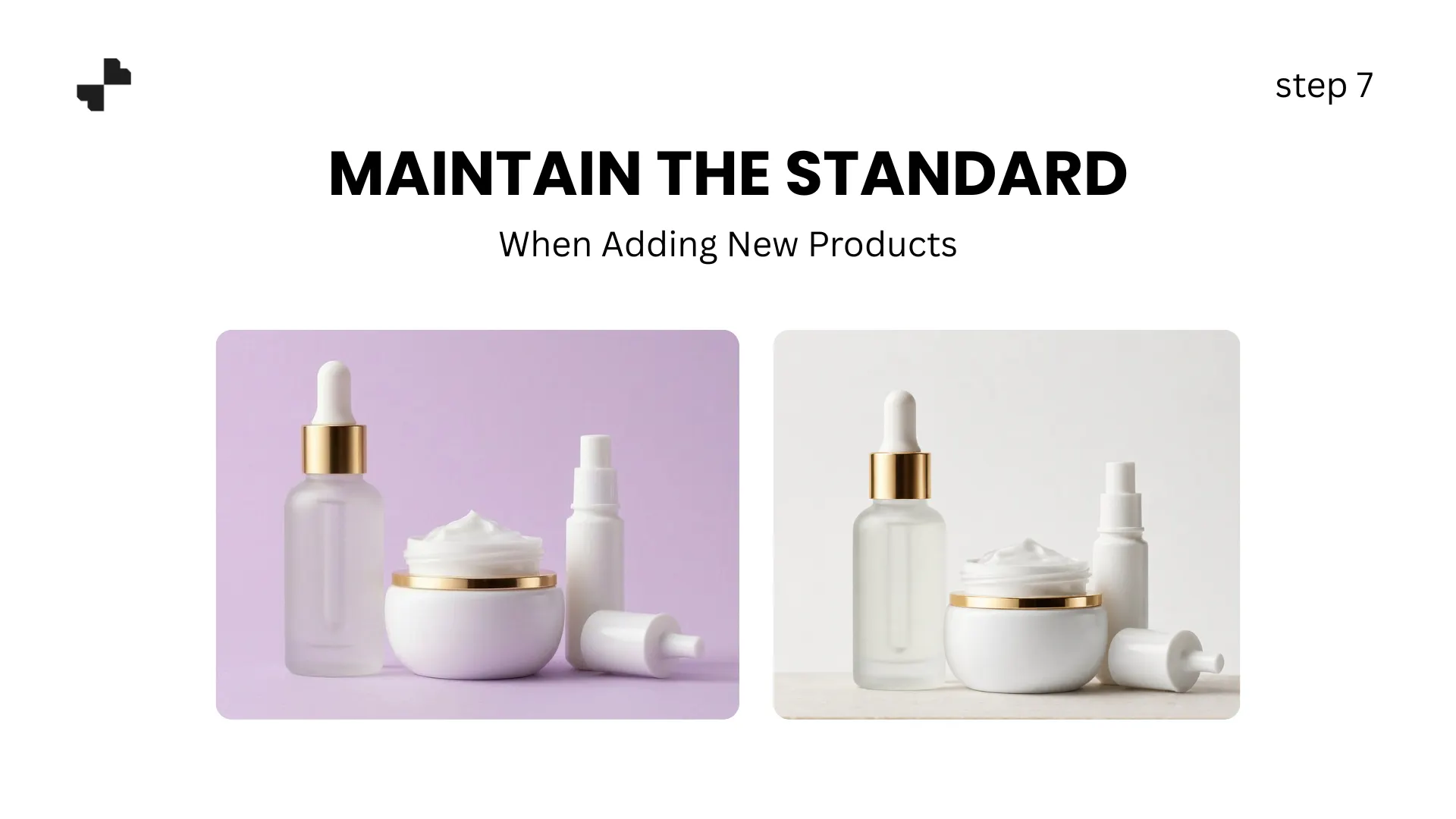
Consistency breaks down over time when new products are shot differently or run through different settings. Avoid this by treating your background prompt and reference image as a living brand asset.
Every time a new product is added to the catalog:
- Start with a clean background removal
- Apply the same saved prompt and settings
- Compare the output against your reference image before publishing
- If the match is off, regenerate rather than accept a "close enough" result
Running all new product listing images through the same ecommerce image editing pipeline keeps your store looking polished months and years after the initial setup.
One Platform for Your Entire Catalog
Building consistent backgrounds used to mean rebooking the same studio every time you added a product. Now you can define a visual style once and apply it to every SKU from one dashboard. Blend handles background removal, scene generation, product image editing, and catalog-wide consistency in a single platform. Upload your first product and start building a catalog that looks like a brand.
Frequently Asked Questions
How many background styles should I use for my catalog?
One primary style for your catalog and collection pages, and optionally one secondary style for social media and ads. More than two styles across your product pages creates visual inconsistency.
Can I use lifestyle backgrounds and still maintain consistency?
Yes, but it requires discipline. Use the same room type, lighting mood, and surface material across every lifestyle image. Varying the environment for each product defeats the purpose of building a cohesive look.
What if my products are very different sizes and shapes?
Keep the background, lighting, and shadow treatment identical. Adjust only the framing and product scale within the image. The visual anchors (surface, light direction, color temperature) are what create the sense of consistency.
Should I use a white background for everything?
White backgrounds work well for marketplace compliance (Amazon main images) and clean catalog pages. But textured surfaces or soft colored backgrounds often perform better for brand-owned stores and social media because they add personality.
How do I keep consistency when I add new products over time?
Save your background prompt and reference image as a brand asset. Run every new product through the same settings and compare against the reference before publishing.
Will AI backgrounds look the same across different product materials?
AI preserves the product exactly as photographed and only generates the background. The consistency comes from using the same prompt, lighting, and surface settings. Very dark or very reflective products may need minor prompt adjustments to match.