You finish a perfect piece: a speckled mug, a small-batch candle, a handwoven throw. You photograph it where you are—on the kitchen counter, a cutting mat, the shop bench—and post it.
It looks… fine.
That gap between how your work feels in your hands and how it lands on a screen is the Kitchen Countertop Problem. It’s not about your craft. It’s about the frame around it: color casts from ceiling bulbs, busy backgrounds, no clear sense of scale, and a feed that swings from garage floor to granite island.
Buyers on Etsy, Shopify, and Instagram make decisions in seconds. If the frame is off, your piece reads smaller, duller, cheaper—none of which is true.
This article is a practical fix for that frame.
What the wrong frame does (and why it hurts)
- Flattens scale. Without a hand, book, or tabletop cue, a vessel or candle tin feels toy-sized.
- Shifts color. Mixed light turns “white stoneware” gray and “warm oak” orange.
- Adds noise. Mail stacks, grout lines, and tool clutter compete with your glaze, weave, or label.
- Kills consistency. A grid that jumps between surfaces and lighting styles erodes trust.
You can solve this physically (clear a corner, buy props, wait for daylight)—or you can solve it digitally after the fact.
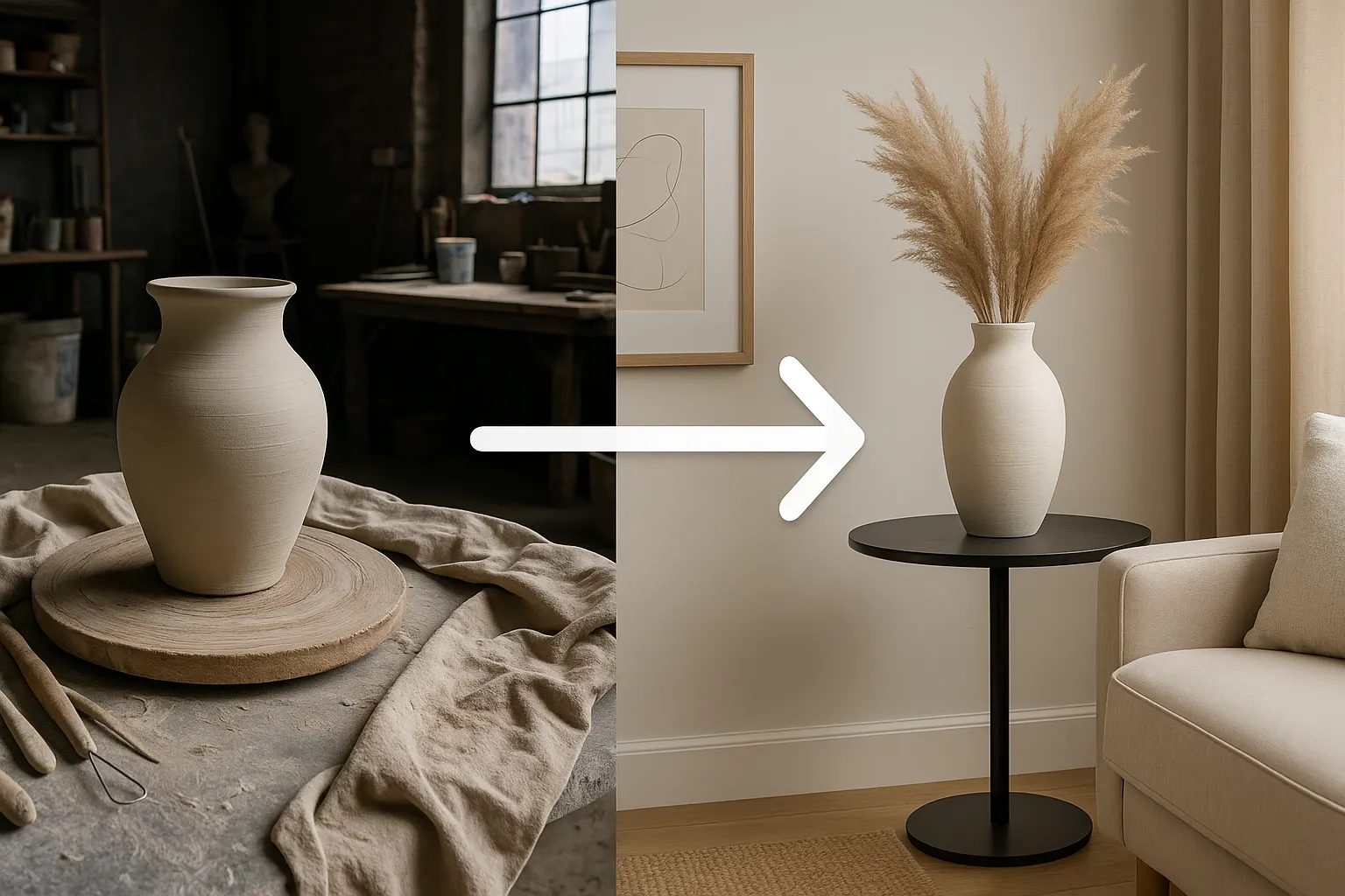
Fixing the frame, fast: a restaging pass
When you only have the countertop photo, the fastest rescue is a restaged version of the same shot: place the piece into a clean, context-rich scene that reads instantly to U.S. shoppers.
That’s where Stage it quietly earns its keep.
- Upload the photo you already have (even if the background is rough).
- Stage it analyzes the item and suggests ideas (scene prompts) that match common shopping contexts—“gallery shelf by a north window,” “minimalist bedside table,” “neutral kitchen island,” and more.
- Pick one or two ideas; Stage it re-shoots the image as if you photographed it in that setting.
- Want something specific? Provide your own idea or an inspiration image (e.g., your brand moodboard).
- Download, and if needed, ask for tweaks (lighter wall, simpler prop, warmer light).
You’re not changing the object. You’re changing the frame so people can read the craft.
Three scene recipes makers reuse (and how to ask Stage it for them)
Use these as your default “ideas” when you generate:
- Gallery Neutral — catalog truth
- Ask for: “matte white wall, shallow shelf, soft window light, gentle shadow, no props.”
- Why: Most accurate color; makes textures pop; perfect first image on Etsy/Shopify.
- In-Use Moment — everyday belonging
- Ask for: “sunny breakfast tray with linen,” or “warm oak nightstand with lamp and book,” or “bookshelf corner, plant nearby.”
- Why: Instantly communicates scale and mood without clutter.
- Materials Story — craft signal
- Ask for: “clean studio vignette with trimming ribbons / wax chips / yarn cone—neatly arranged.”
- Why: Shows the human hand without the mess.
Pick a palette (cool white + pale wood, or warm linen + oak) and repeat it. Stage it lets you choose similar ideas each time so your catalog develops a recognizable look.
A 10-minute listing flow for makers
- Shoot once, anywhere. Don’t wait for perfect light.
- Stage it pass (2 ideas): generate Gallery Neutral and In-Use versions.
- Detail crop from either image (lip, weave, label, stitching).
- Keep one raw shot in the carousel for transparency.
- Publish with the neutral image as thumbnail; test the in-use image on social.
Total: ~10 minutes. No props, no rearranging a room, no re-shooting tomorrow.
Honesty rules that build trust (and protect your brand)
- Color first. If the real piece looks warmer/cooler in person, regenerate with a light tweak and pick the truest version.
- Anchor scale. Ask for a simple anchor (book, coaster, nightstand) or include a hand shot.
- Name the frame. In your listing, one line like “Styled for scale; final photo shows the piece on our bench” earns credibility.
- One hero, two supporting images. More than three staged angles rarely adds value.
Stage it supports this style of honesty: you can generate multiple ideas, keep the real workshop image, and present both—the story and the truth—side by side.
Examples by craft (prompts you can paste into Stage it)
Ceramics
- “Neutral gallery shelf, north-light, soft shadow, no props.”
- “Breakfast tray, linen napkin, kettle steam implied, cozy morning.”
- “Studio vignette with trimming ribbons arranged neatly.”
Candles
- “Stone kitchen island, subtle window reflection, uncluttered.”
- “Bookshelf corner, hardback novel, small frame, afternoon light.”
- “Wax chips and fragrance notes, clean flatlay.”
Textiles
- “Plain bench, folded throw, white wall, soft daylight.”
- “End-of-bed scene, linen duvet, morning light.”
- “Yarn cone and swatch card, tidy studio.”
Jewelry
- “Small plaster plinth, museum wall, diffused light.”
- “Close crop, hand/ear with window light, minimal background.”
- “Bench vignette, tools arranged, no debris.”
Why makers stick with it
- Speed: You post today’s piece today.
- Consistency: Reusing the same two or three ideas turns a scattered feed into a brand.
- Control: You can re-generate until the piece reads true.
- Respect for the craft: The object stays itself; only the frame changes.
Try this once (a tiny challenge)
Take the last countertop photo you posted. Run it through Stage it with “Gallery Neutral” and “In-Use: nightstand + lamp” ideas. Swap your thumbnail and watch how the piece reads. If it finally looks the way it feels in your hands, you’ve solved the Kitchen Countertop Problem.
Your work is strong. The frame should be, too. Stage it just makes the fix the easiest part of your week.