Creating a logo is often one of the first steps people take when launching a brand. Unfortunately, it's also one of the most overcomplicated. Many founders believe they need weeks of brand strategy, multiple concepts, and expensive designers before they can even launch. In reality, most early-stage brands don't need a perfect logo. They need a usable one.
This guide walks you through creating a clean, practical logo using Blend's logo maker, without overthinking the process or slowing down your launch.
Why a Logo Maker Is Enough for Early-Stage Brands
Logos is important, but it is not the brand itself; it is simply a visual identifier. At an early stage, a logo's job is not to tell a story or win design awards. Its role is far more practical: to clearly and consistently identify your brand across touchpoints.
This is where a logo maker is enough. Early-stage businesses need logos that are recognisable, legible, and usable across platforms such as websites, social media, listings, and presentations. A logo maker focuses on function over theory, helping you get something that works everywhere without friction.
Over-investing in a logo too early often delays launches and distracts founders from building the actual product or business. Many successful brands started with simple marks that evolved as the business matured. A logo maker supports this reality by giving you a "good enough" logo now—one that avoids confusion, works at small sizes, and lets you move forward—rather than pulling you into a long, expensive branding cycle too early.
What to Prepare Before Using a Logo Maker
Before opening a logo maker, it helps to have a clear understanding. Knowing your brand name, the industry you operate in, and the general tone you want to convey—modern, minimal, playful, or bold- makes the process faster and more focused. This preparation prevents endless experimentation and helps you evaluate logo options with intent instead of guesswork.
You don't need a moodboard or brand manifesto at this stage. need sufficient direction to make sound decisions and move forward confidently.
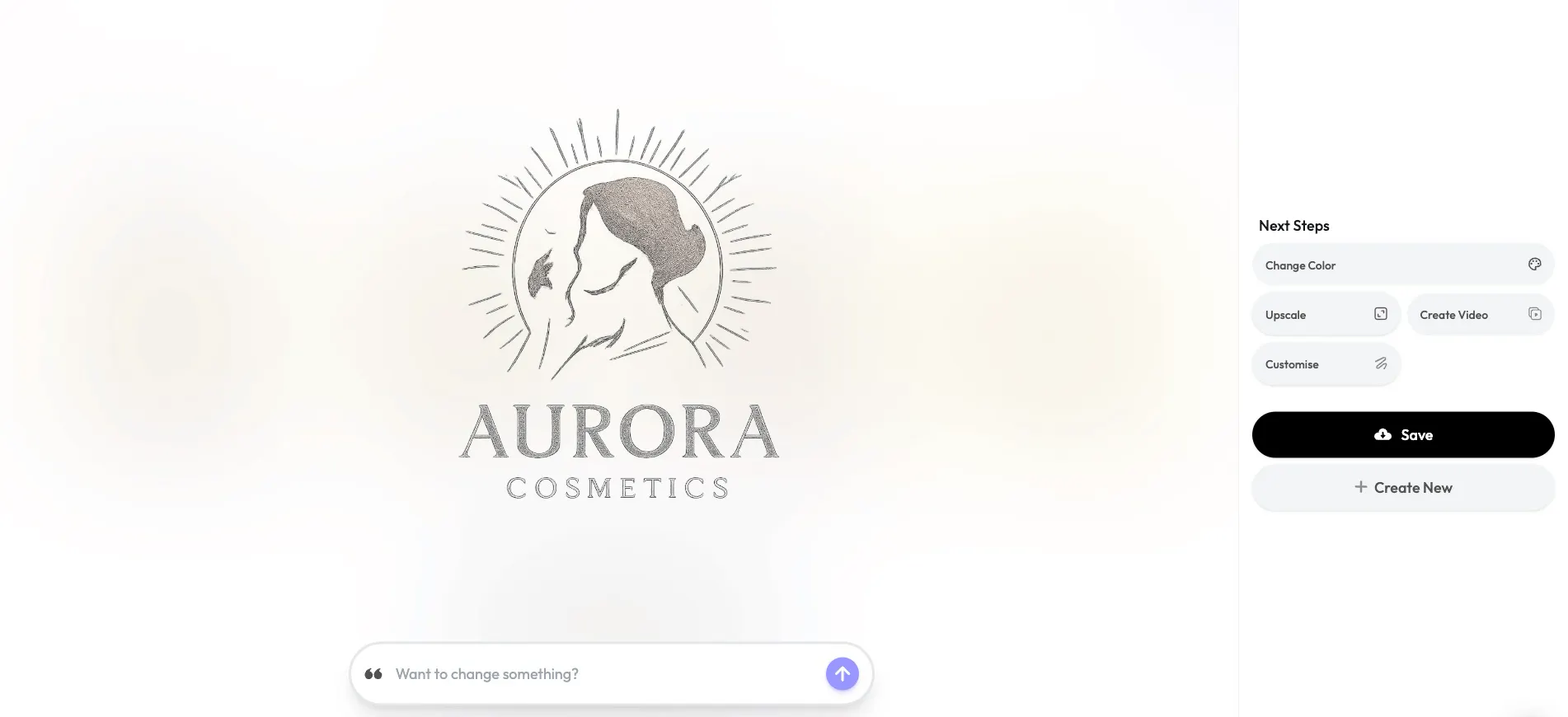
How to Create a Logo Using a Logo Maker
Creating a logo is one of the first things founders want to finish—and one of the easiest places to get stuck. Many assume it requires weeks of brand work and a designer, but early-stage brands just need a usable logo: clean, clear, and ready for websites, listings, and social profiles. This is where a logo maker like Blend helps you move forward without friction.
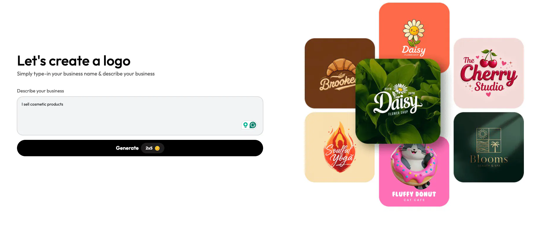
Step 1: Define the Brand Basics (Name and Context)
Every logo starts with context. Before making any visual decisions, you need to define the brand's name and purpose. This isn’t about crafting positioning statements or brand narratives. It’s simply about giving enough information so the logo doesn’t feel random.
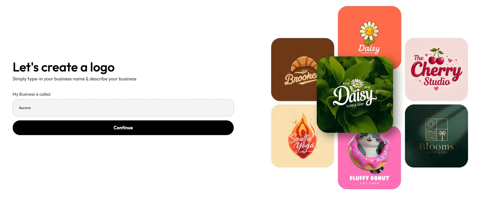
In Blend, this step is reduced to its essentials. You enter your business name and briefly describe what you do. That description helps narrow visual directions so the system doesn’t generate styles that are completely irrelevant to your space.
At this stage, it’s important not to overthink your input. Even a simple line like “I sell cosmetic products” is enough to guide the initial direction. You’ll have opportunities to refine later.
Step 2: Explore Logo Styles and Templates
Once the basics are set, the next natural step is exploration. This is where most people get stuck when working with designers: too many concepts, too many directions, and no clear way to compare them.
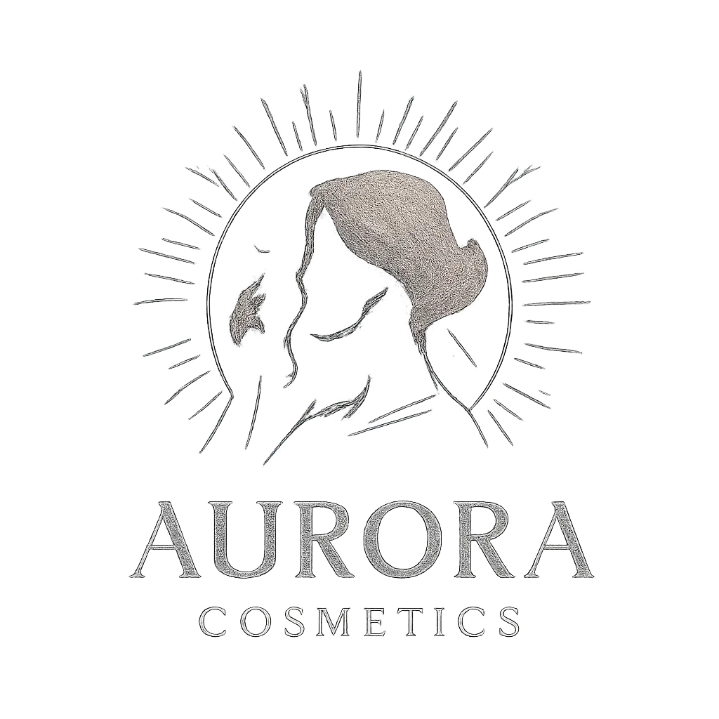
Blend simplifies this by presenting logo styles as templates. These templates represent different visual approaches, including lettermarks, abstract marks, icons, line art, and illustrative styles. Instead of imagining how a style might look, you can see your brand name applied across different formats instantly.
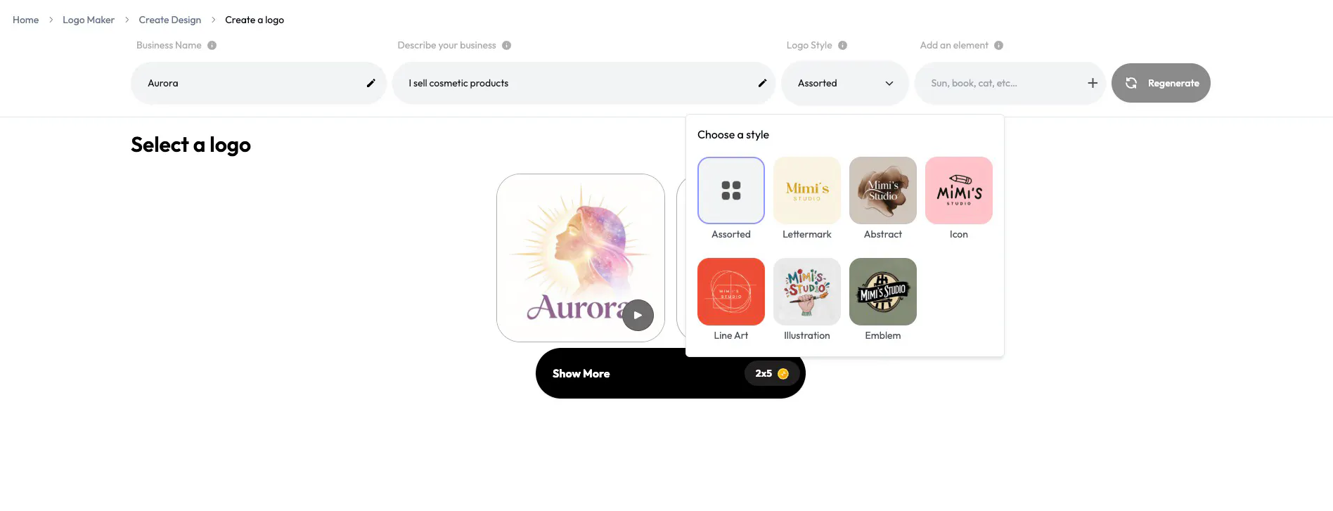
The key decision here is not about picking the most expressive logo, but the most adaptable one. For new brands, simpler styles tend to work better because they scale easily across different surfaces. You want something that reads clearly at small sizes and doesn’t rely on excessive detail.
Step 3: Refine Typography, Colour, and Layout
After choosing a direction, refinement is where the logo starts to feel intentional. This is where you adjust typography, colour, and spacing to make the logo balanced and usable.
Blend keeps this stage focused by limiting the number of controls. You’re not overwhelmed with advanced design tools. Instead, you can fine-tune the elements that matter most: font style, colour, and overall layout. This prevents overdesign while still giving you enough control to ensure the logo feels right.
A good rule of thumb here is to prioritise versatility. Logos that work in monochrome and with a single primary colour are far easier to use across websites, packaging, and digital platforms.
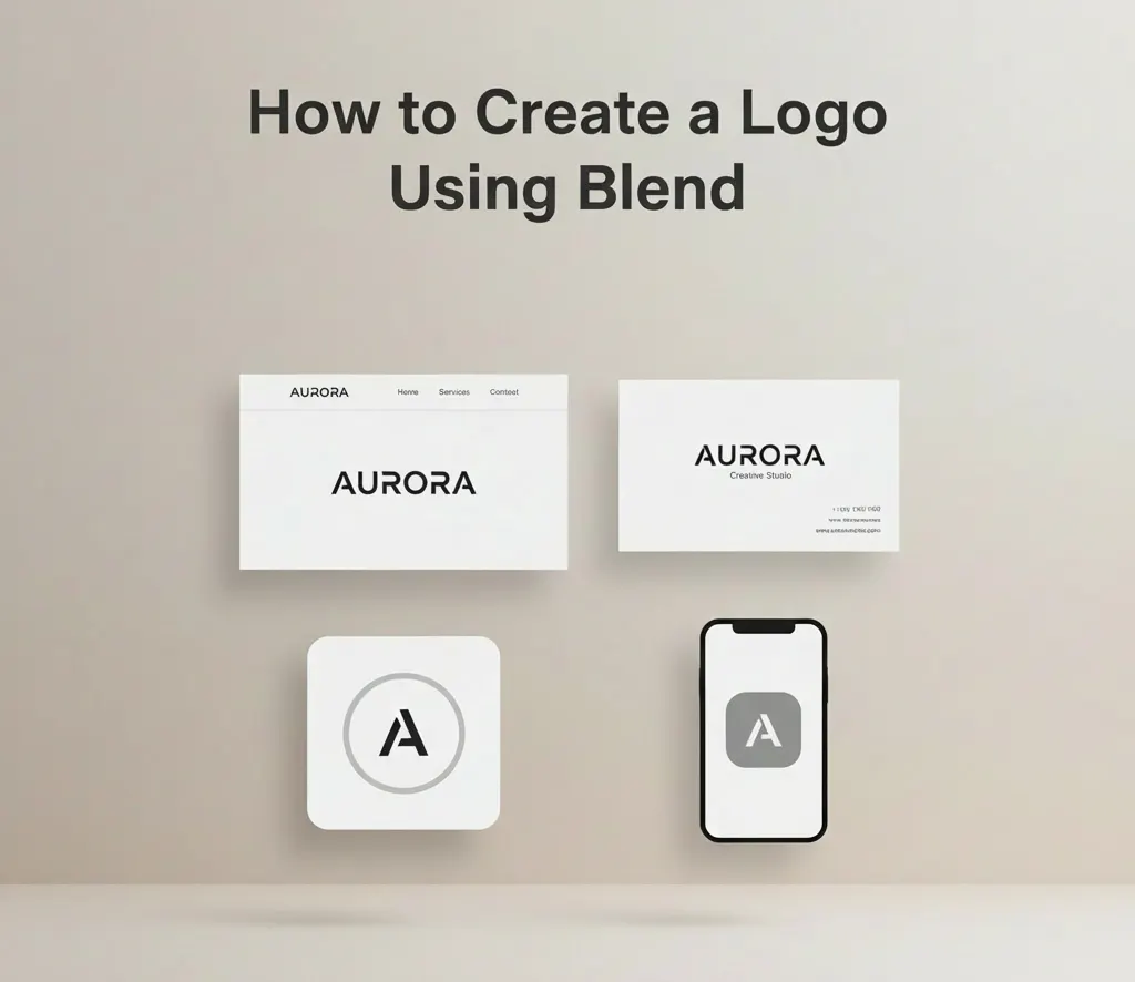
Step 4: Test the Logo in Real-World Use
A logo isn’t finished when it looks good on a blank canvas. It’s finished when it works where it will actually be seen, on headers, profile images, and brand assets.
Blend lets you preview and iterate on your logo before saving, helping you spot issues early. This is where you check whether the logo appears too tight, too thin, or too complex at realistic sizes. If it reads clearly and feels balanced, it’s doing its job.
This step is less about design perfection and more about confidence. A logo that feels simple and usable will almost always outperform one that looks impressive but is hard to apply consistently.
Common Mistakes to Avoid When Creating a Logo
One of the most common mistakes is trying to make the logo do too much. Adding too many elements, effects, or trendy styles can make it difficult to use consistently. Another mistake is choosing colours or fonts that look good in isolation but fail to hold up across different backgrounds or sizes.
A good logo should feel neutral and flexible. If it requires special treatment every time it's used, it will slow you down rather than support your brand.
Conclusion
A logo maker is not a shortcut—it's a practical starting point. It allows you to quickly create a clean, usable logo and focus your energy on building the business. As your brand grows, your identity can evolve with it. But early on, momentum matters more than perfection. Start simple, get visible, and refine when the time is right.
Create your logo on Blend and get a clean, usable identity you can start using immediately, no design background required.